
The problem
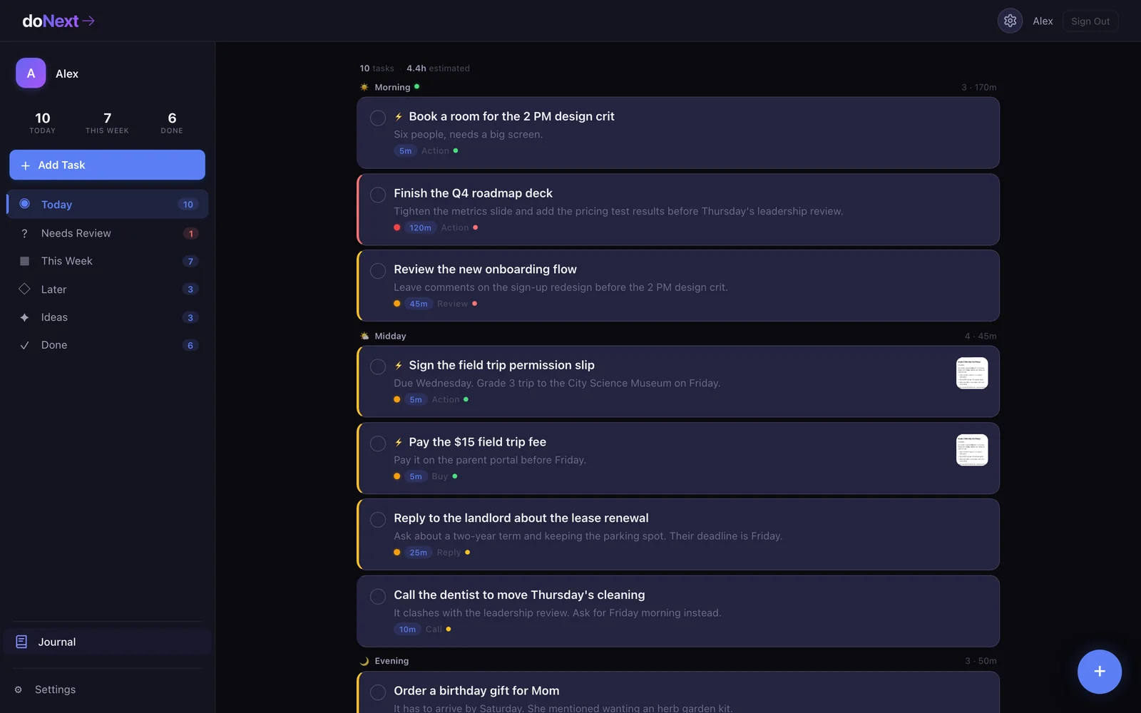
doNext turns the messiest input you've got into a scheduled task in one send. That's the whole fight in this category. The few seconds between having a thought and logging it are where busy people drop work, and sorting the list afterward is a second chore most of them skip.
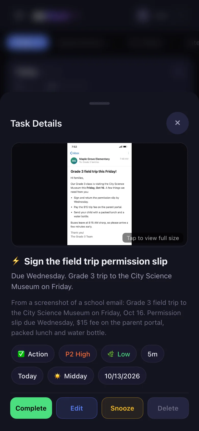
I set the bar in the brand doc with one line: "Zero friction to capture, maximum clarity to execute." You type it, say it, snap a photo or paste a screenshot of a message. The AI hands back a task with an action-verb title, a time estimate, an energy level and a slot in your day. For a daily user, that's 60+ hours a year they stop spending on typing, tagging and planning by hand.
The day after the first release, I took the market apart and found three gaps worth owning. None of the top 5 apps asked a clarifying question when you added a task. Microsoft To Do buried overdue work (its top complaint), Things 3 nudged so gently it was easy to ignore, and Todoist had pulled the AI Smart Schedule its users missed. I rebuilt doNext to close all three.
Who it's for
doNext is for people holding too many threads at once: founders, busy professionals and anyone whose to-do list really lives in their messages. The copy and the AI's categories lean into an ADHD-friendly design.
I ran two rounds of competitive research from public sources, and turned each one into shipped features within days. The first took apart how 5 apps handle dashboards and overdue work. The second mapped what people love and complain about across 8, Todoist and Notion among them, and ranked the features they were missing.
Two findings set the roadmap. Search is table stakes, since apps without it lose people. And the second study closed on a line I kept coming back to: "Design matters more than features."
I also set the AI to read work the way it really arrives. Any message from a client, guest or customer becomes a high-priority "reply needed" task.
Key decisions
Two rules drove every call: capture is instant, and the AI's guesses are cheap to fix. Everything below follows from them.
Capture never waits on the AI
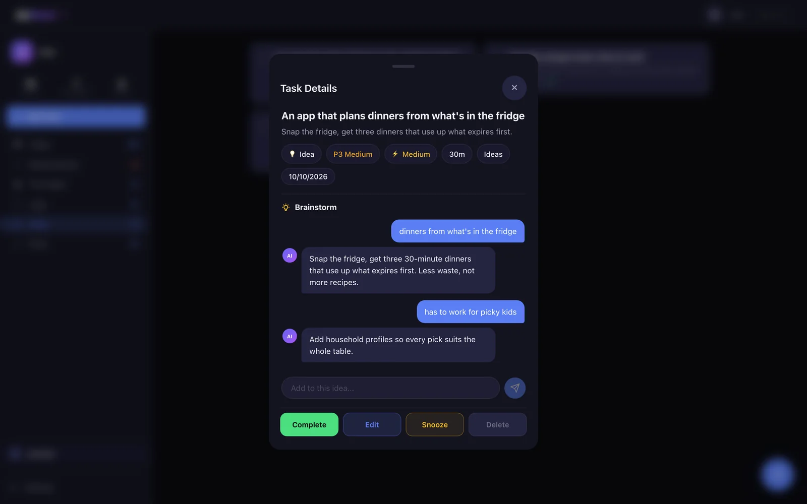
The add window closes the moment you hit send, so logging a task feels as quick as sending a text. The AI works in the background behind a small banner for processing, done, or an error with a retry. Early on I forced one task per input and dropped repeats within 5 minutes so it could never flood the list. Once that held, I brought back splitting one input into several on the iPhone app, behind a checkbox confirmation. It's the only step in the product that ever blocks.
Low-confidence guesses go to Needs Review
Anything the AI scores below 0.7 confidence lands in Needs Review, where one tap on "Looks Good" accepts it. The tab hides when it's empty, so a clean day carries no extra step. A vague task still gets a best guess, plus a small question on the card (Today, Tomorrow, This Week, No deadline) that fades after a few seconds. My research called for a gentle assist that never stops you, and that's what shipped.
Plan the day around energy
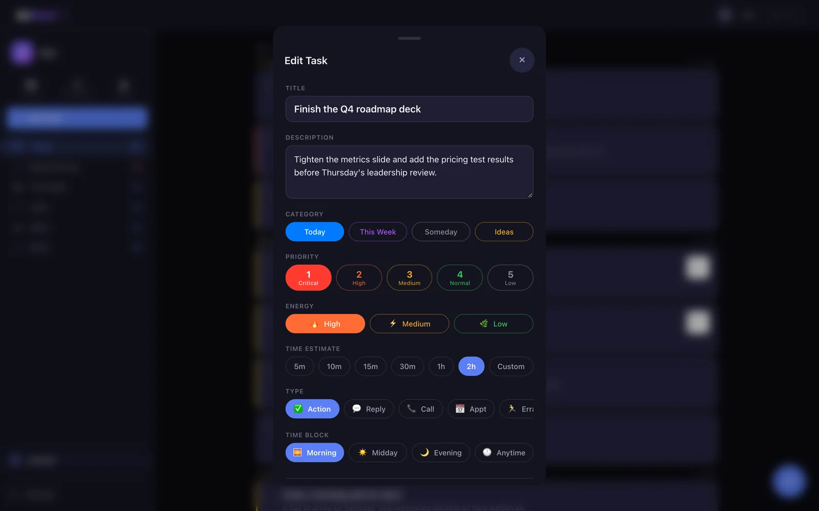
High-focus work lands in the morning. Shopping, quick replies and reading land in the evening. Add something urgent and the whole day re-plans itself, hard things first. The brand doc names it the core differentiator, and it does the daily planning most people skip.
Rebuild the dashboard from the research
Version 4.0.0 turned the 5-app study into a new Today screen. Overdue tasks jump to the top with "X days late" badges. Soft dates split from hard deadlines, an idea I took from Things 3, and priority dropped to 3 levels you can read at a glance. Reminders escalate with every day late and every repeated snooze, up to a pulsing red critical state. The research argued for amber on overdue work and red only for a missed hard deadline. I shipped orange for newly late tasks and red once they turn high or critical.
How I built it
On my own, I shipped what a typical product team would spend $150K+ building. I owned the product, the design and every review. Work ran off a phased plan, and a running status file tracked what was live and what I still owed.
I ran the build in parallel workstreams. The iPhone app's feature set was split three ways, and a later round turned the 8-app competitor study into 5 new features, search and subtasks among them. QA covered 200+ test cases across auth, AI, the dashboard, security and billing.
I built the AI layer to protect margin. It runs on 2 tiers through OpenRouter. Gemini 2.5 Flash reads screenshots and the cheaper Flash Lite handles text. Every call logs its cost, and admins can swap models from the panel without touching code. I planned AI spend at about a cent per task, which leaves 79% gross margin on a monthly plan after AI and payment fees.
doNext gets sharper for each person the more they use it. Every 3 actions, it rebuilds that person's profile from their last 100: which categories they keep fixing, which way they move priority and when they do their best work. Delete more than 30% of what it makes and it's told to be more conservative. Snooze more than 30% and it schedules less aggressively.
For the iPhone app I wrote a parity checklist of about 215 items that opens with App Store rules, so review holds no surprises. Stripe isn't allowed for digital subscriptions inside iOS apps, so StoreKit 2 and Restore Purchases sit at the top.
What changed
doNext went from first commit to a live product with paid plans in 8 days, 10x faster than a typical team's MVP timeline. That's v1.0 to v4.6.0 in 95 commits between March 24 and 31, 2026.
It's live at donext.io on 4.6.0, the last version I shipped. Stripe billing runs at $9.99 a month or $99.99 a year after a 14-day trial that doesn't ask for a card, and a 9-tab admin panel lets one person run the whole business: users, subscriptions, AI cost, errors and bug reports.
I kept the economics lean. Fixed running costs are low enough that 2 paying subscribers cover them, and I launched as an installable web app so Apple's $99 a year fee waits until revenue pays for it.
The Flutter iPhone app followed in 27 commits between March 30 and April 6, about 27,900 lines of Dart. StoreKit 2 is the next build before it goes to App Store review.
What's next
The next move is to put doNext in front of real users and time the moments that matter: a messy screenshot to a scheduled task, a Needs Review fix and a full day planned, then let that data settle the overdue color. From there, I ship StoreKit 2, clear App Store review and grow to 1,000 paying subscribers, which is $110K a year in recurring revenue at today's prices.