
Methods
- SWOT competitive analysis
- User interviews
- Qualitative analysis
- Quantitative analysis
- Persona
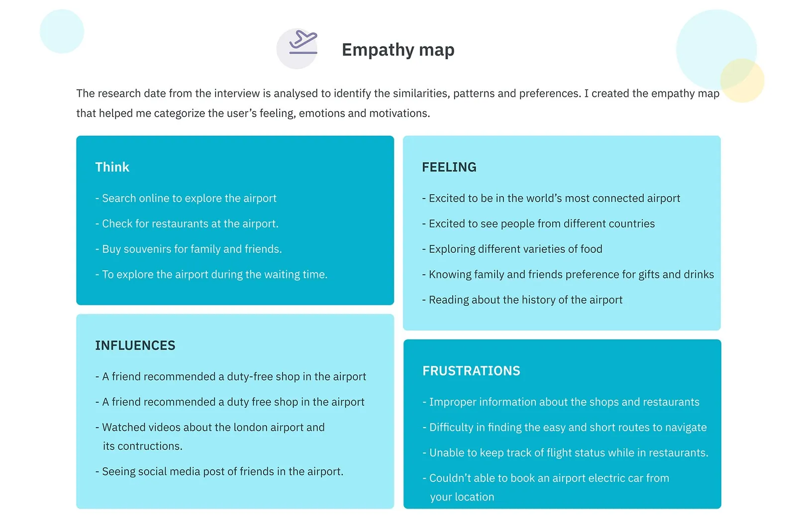
- Empathy map
- User flow
- Low-fidelity wireframes
- UI style guide
- High-fidelity design
The problem
Big airports are hard to get around. People struggle to find the quickest route to the baggage counter or their gate, and with time to spare, they can't tell which restaurant, shop or lounge is worth it. Some found it hard to book the airport's electric car.
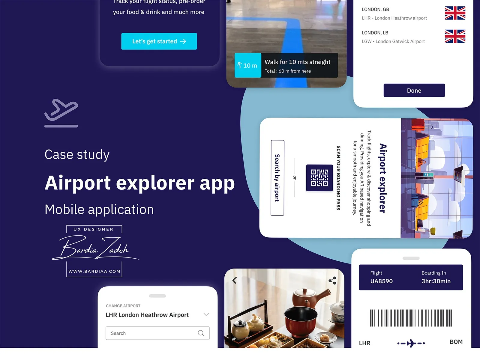
Airport Explorer was an assignment: a mobile app that gives passengers a full guide to their airport. Scan your boarding pass or pick your airport, find places to eat and shop, follow AR directions there and keep an eye on your flight.
Research
I started with what already existed, and there wasn't much. Most airport apps belong to one airport, like Heathrow's, so you have to go find the right one first.
I ran a SWOT on the Heathrow app. It had real-time flight alerts, shop and restaurant info, meal pre-ordering and a help option, with a 4.5 star user rating. Its gaps were about getting around: no directions to the baggage counter or gate, and no way to book an electric car.
Then I interviewed passengers. The pain points lined up: finding the boarding gate, getting from one place to another, picking the best nearby food and shops, booking the electric car. Support was mixed. 90% said airport assistance helped them right away, yet getting help quickly still came up as a pain point.
Who it's for
I focused on passengers who want to explore the airport while they wait for a flight: anyone from 16 to 80 who's comfortable with tech, whether they fly often or now and then.
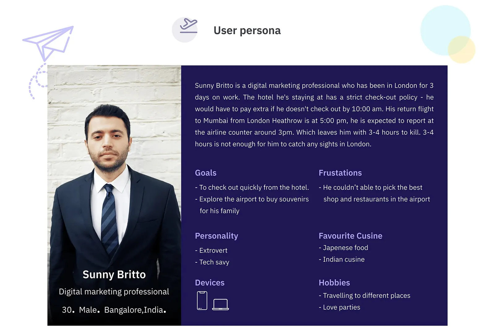
My persona, Sunny Britto, is a 30-year-old digital marketer finishing 3 days of work in London. His hotel charges extra if he isn't out by 10:00 am, and his flight to Mumbai leaves Heathrow at 5:00 pm with check-in around 3. That's 3 to 4 hours to kill, too short for sightseeing. He wants a good Japanese brunch and souvenirs for his family, and can't tell which places are any good.
Flows and structure
The app opens on one choice: scan your boarding pass or search for your airport. Scanning pulls in your flight details, so the app can warn you about delays and boarding while you're shopping or eating.
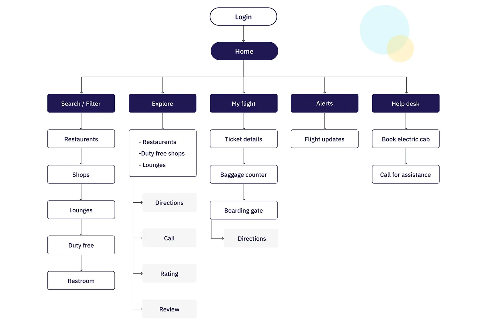
Home splits into five areas: Search and filter, Explore, My flight, Alerts and Help desk. My flight leads straight to directions for the baggage counter and gate, since finding the gate was one of the most common complaints.
Wireframes
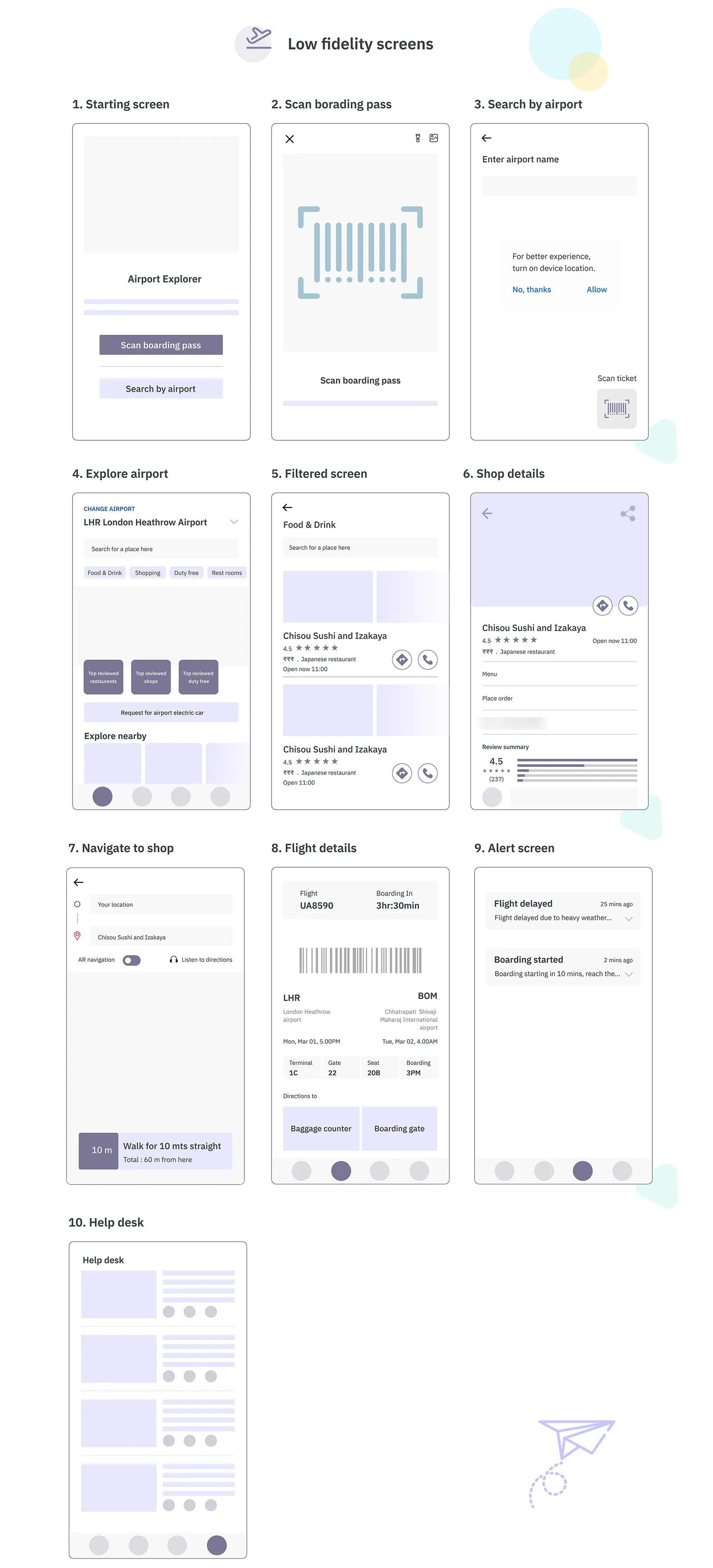
I laid out 10 low-fidelity screens before any styling, from the start screen to the help desk. Most of that layout carried straight through to the final design.
Design
The look is a deep navy (#1E1754) and a bright cyan (#00CEEE), set in IBM Plex Sans.
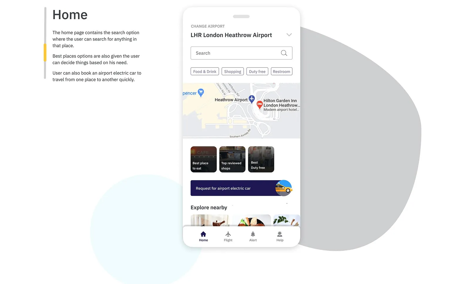
Home is built around search. Under it sit quick filters for Food & Drink, Shopping, Duty free and Restroom, a map, shortcuts to the best places to eat and the top reviewed shops, and a button to request an electric car.
Tap a filter and you get places with their rating, distance and opening status. A restaurant's page lets you call or pre-order, so you can skip the crowd and keep your distance.
Getting there
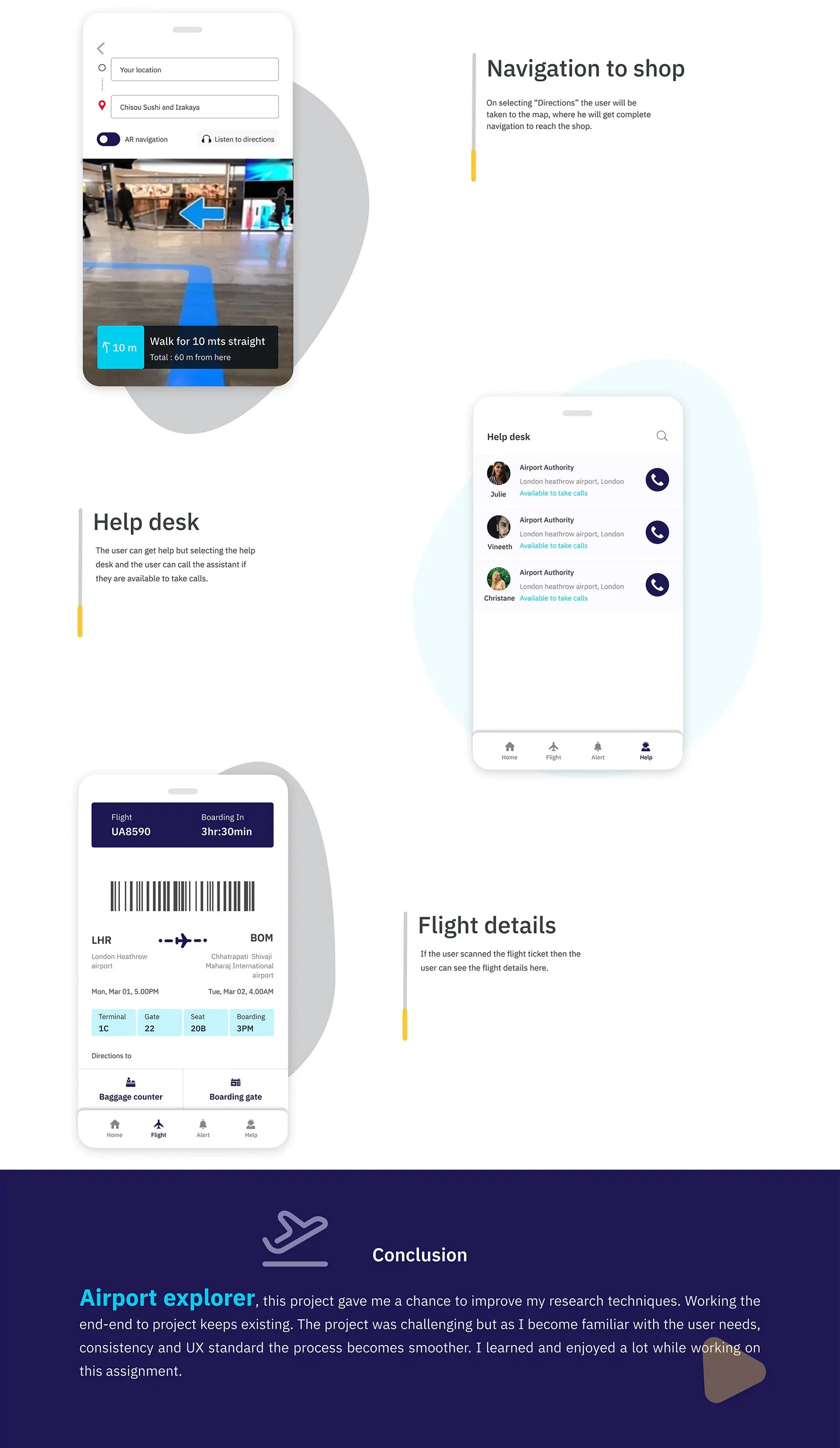
Tap Directions and the map takes over. Switch on AR navigation and the route shows up on the floor through your camera, with steps like 'Walk for 10 mts straight'. You can also have the directions read out.
The Flight tab keeps your boarding pass handy, with time to boarding, gate and seat, plus one-tap directions to the baggage counter and gate. Help desk lists airport staff and who's available to take calls.
This study comes from my earlier portfolio, where it was one long image. I rebuilt it as a readable page in 2026; the figures are the original slides.