
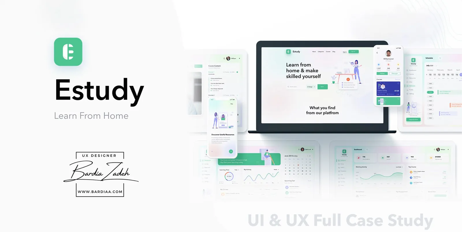
Methods
- User activity tracking
- Question design
- Survey
- Competitor analysis
- SWOT analysis
- Persona
- Empathy map
- User flow
- Task flow
- Information architecture
- Paper sketching
- Wireframes
- Visual design
The problem
After choosing a course, students couldn't get proper guidance from their mentors, and live support from mentors and peers was one of the biggest gaps. Estudy is the e-learning platform we designed to close it.
We set four goals. Students should get career guidance from mentors. They should be able to talk live with mentors and friends by audio, video or text. Course videos should come with subtitles and an audiobook. And they should be able to buy a single class or a weekly, monthly or yearly subscription.
Research
The research showed the gap on both sides. We defined the users as students, teachers and admins, then listed what students and teachers deal with before, during and after a course.
Students had assignments reviewed late or never, no live support, and no view of their own progress. Teachers were paying for tools and struggling to market courses and run classes online.
We ran a survey (46 responses) and compared 8 e-learning competitors. Only 3 of the 8 ran live classes. Only 2 had a mobile app, and our note on one of them was "Yes, but very bad."
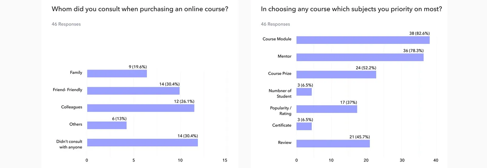
The survey pointed the same way. Asked what matters most when choosing a course, 38 of 46 picked the course module and 36 picked the mentor. Asked whether a mentor reviewed their assignments regularly, 60% said "probably no" and 25% said no. And 78% wanted to pay with mobile banking like bKash or Rocket.
Who it's for
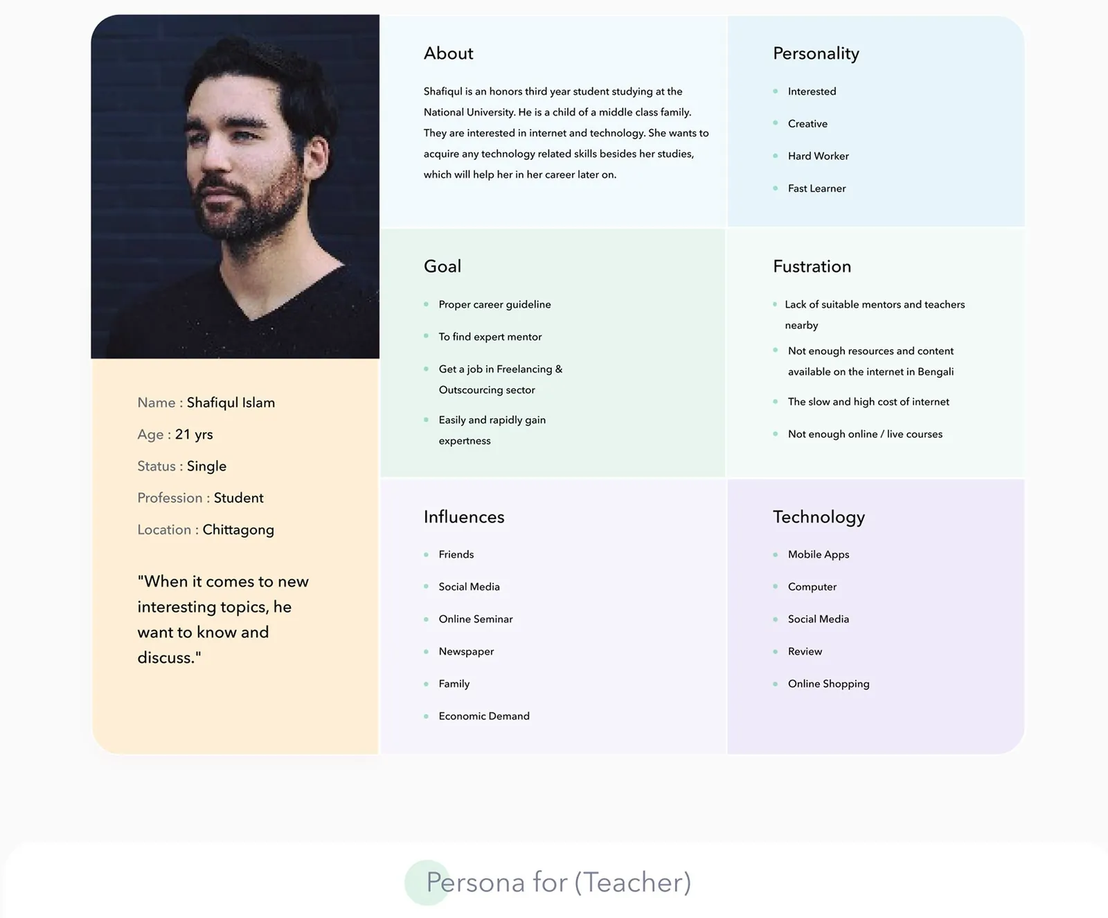
We built two personas. Shafiqul is a 21-year-old student in Chittagong who wants tech skills for freelancing work. He can't find good mentors nearby, there's too little content in Bengali, his internet is slow and expensive, and live courses are scarce.
Masud is a 30-year-old graphic designer in Dhaka who already guides a few students and wants to teach more and earn passive income. He's juggling paid tools, and promoting courses is hard. Each persona got an empathy map too.
Flows and structure
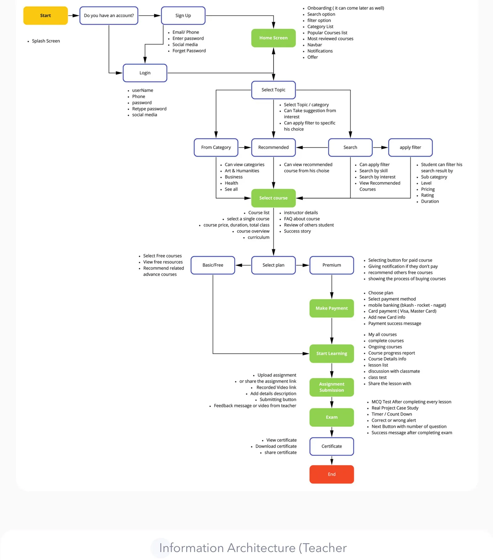
The flows and information architecture are where findings turned into screens. The student path runs from sign-up through topic, course and plan to payment, lessons, assignments, exam and certificate. Free courses skip payment.
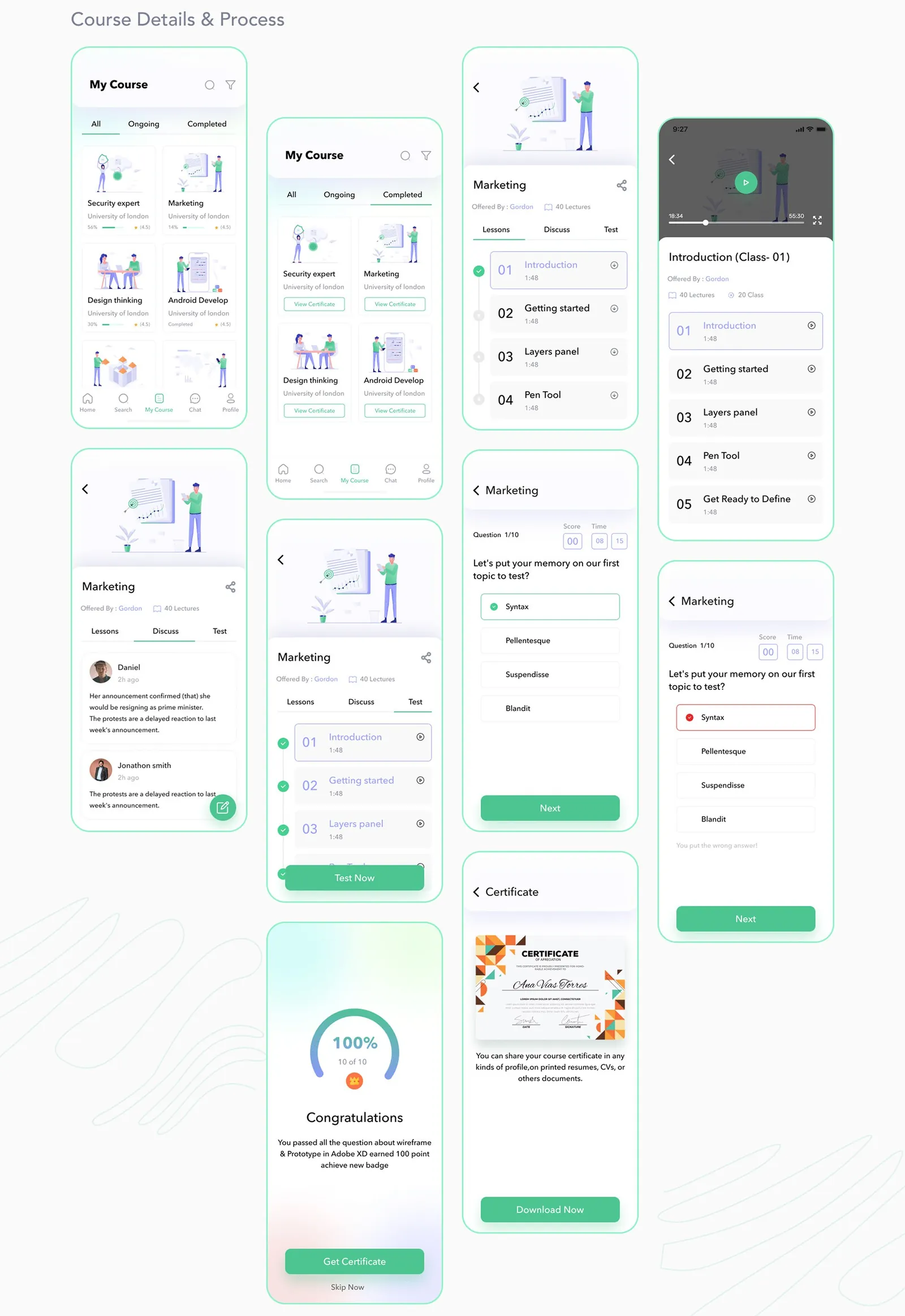
Checkout lists mobile banking (bKash, Rocket, Nagad) next to cards. Every lesson ends with a timed MCQ test. Submitted assignments get a feedback message or video from the teacher, and the teacher IA has its own review-and-mark step.
Sketches and wireframes
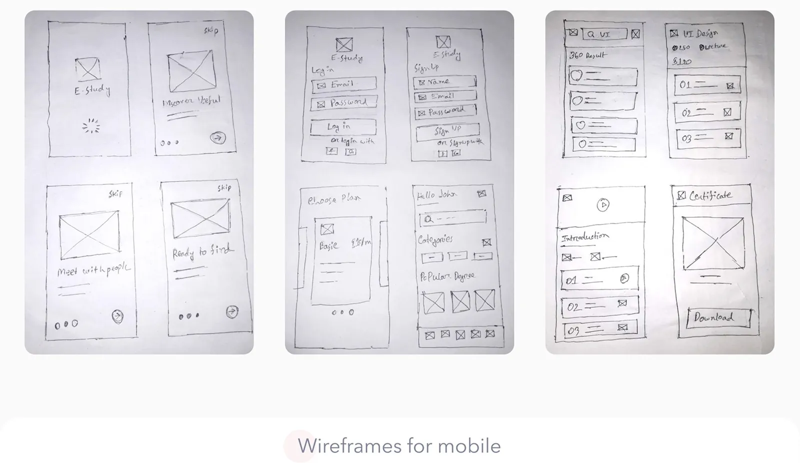
I started the interface on paper, from onboarding and login to search results, lessons and the certificate. Those sketches became grey wireframes for the app and dashboards before any color went in.
Design
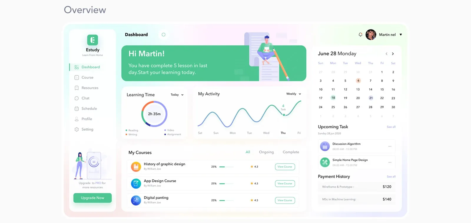
The student dashboard puts progress up front, since students couldn't see theirs. It opens with learning time, a weekly activity chart, per-course progress and upcoming tasks. A teacher dashboard and a marketing website sit alongside it.
The teacher side
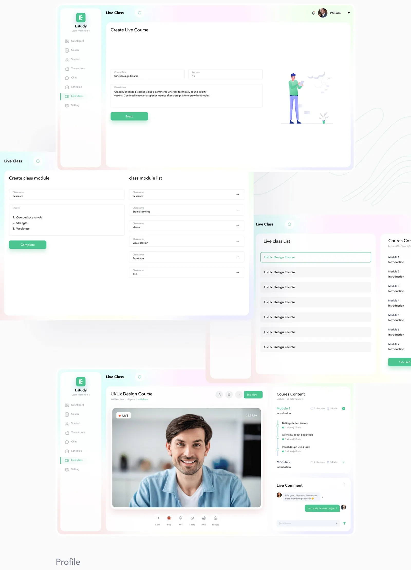
Teachers get the live tools the survey asked for. In the Live Class area they create a live course, split it into class modules and go live with comments running next to the video. That's aimed at the 80% who wanted live courses.
The mobile app
The app carries a student from browsing to a certificate. They filter search by level, price, rating and duration, then work through lessons, discussion and timed tests. Passing leads to a certificate they can download and share.
Chat splits instructors from peers, so a mentor is always one tab away. The case study ends at high-fidelity screens and doesn't include usability testing.
This study comes from my earlier portfolio, where it was one long image. I rebuilt it as a readable page in 2026; the figures are the original slides.