
Methods
- SWOT competitive analysis
- User interviews
- Persona
- Empathy map
- Journey map
- Information architecture
- User flow
- Wireframes
- Style guide
- High-fidelity design
The problem
Booking a specialist was hard, and the pandemic made it worse. People avoided hospitals and expected to see their doctor online, but couldn't get appointments with specialists at the best hospitals.
I ran a SWOT analysis on 2 existing apps, Practo and Mfine. Both had 4.5-star user reviews and both had gaps. Practo's deep, multi-level structure confused people. Mfine had no video calls and too many steps to book.
So I set rules for Medcare: booking in 3 to 4 steps, doctor profiles with rating, reviews and experience, search by symptom, and alerts only with the patient's permission.
Research
Plenty of people had tried a booking app. Far fewer found the right doctor through it. My interviews covered 5 questions, from whether they'd used one to whether they'd use it again.
80% had used one. Only 40% found the right doctor, and only 40% would use the same app again. Reminders were the bright spot: 90% got them after the consultation.
The most common problem was finding a doctor by language and experience. People preferred video or phone appointments because of the pandemic, and they were scared to order medicine online because the information about it, like the expiry date, wasn't good enough.
Who it's for
Medcare has 2 sides: the patient who needs help and the doctor who treats them and writes the prescription. I made a persona for each.
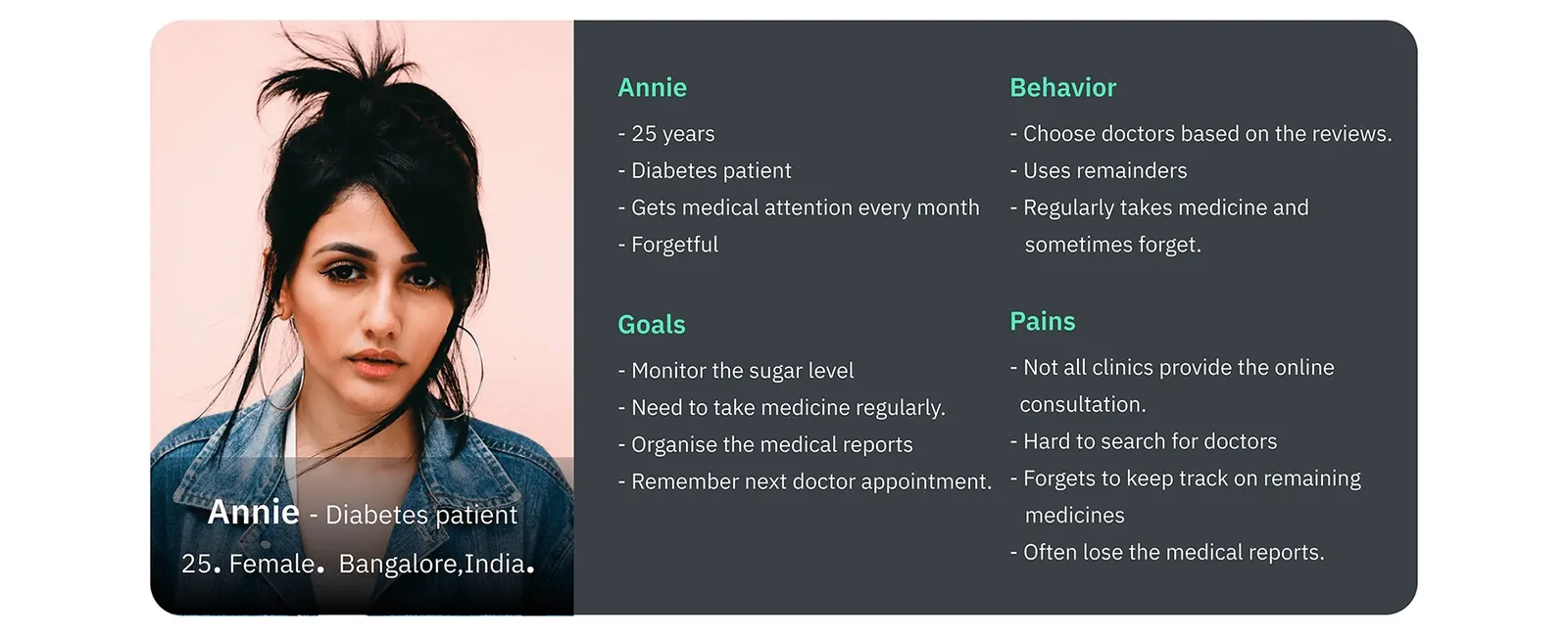
Annie, my patient persona, is 25 and has diabetes. She picks doctors by their reviews and keeps losing track of her medicine and reports. Christina, my doctor persona, is a 35-year-old endocrinologist whose patients forget their lab results and call after hours.
The empathy map listed the patient's frustrations, including poor information about doctors and not finding one who speaks your language.
Journey map
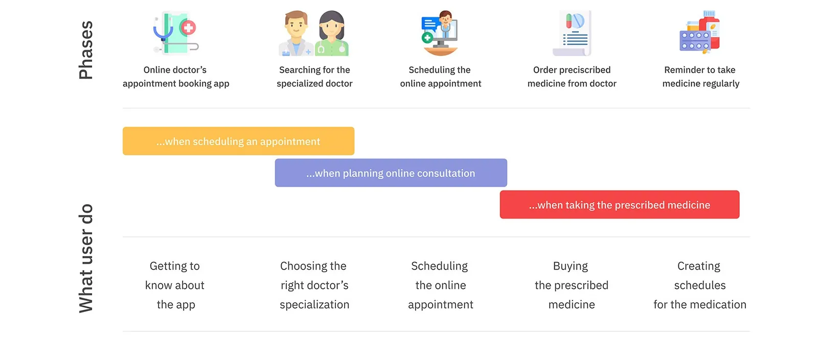
Each low point in the journey map turned into an idea. The patient goes through 5 phases, from hearing about the app to building a medication schedule, feeling anxious, tense, hopeful, tense again, then satisfied.
Not knowing what kind of doctor you need led to immediate consultation. Forgetting whether a pill goes before or after food led to a medicine reminder you can mark as taken.
Flows and structure
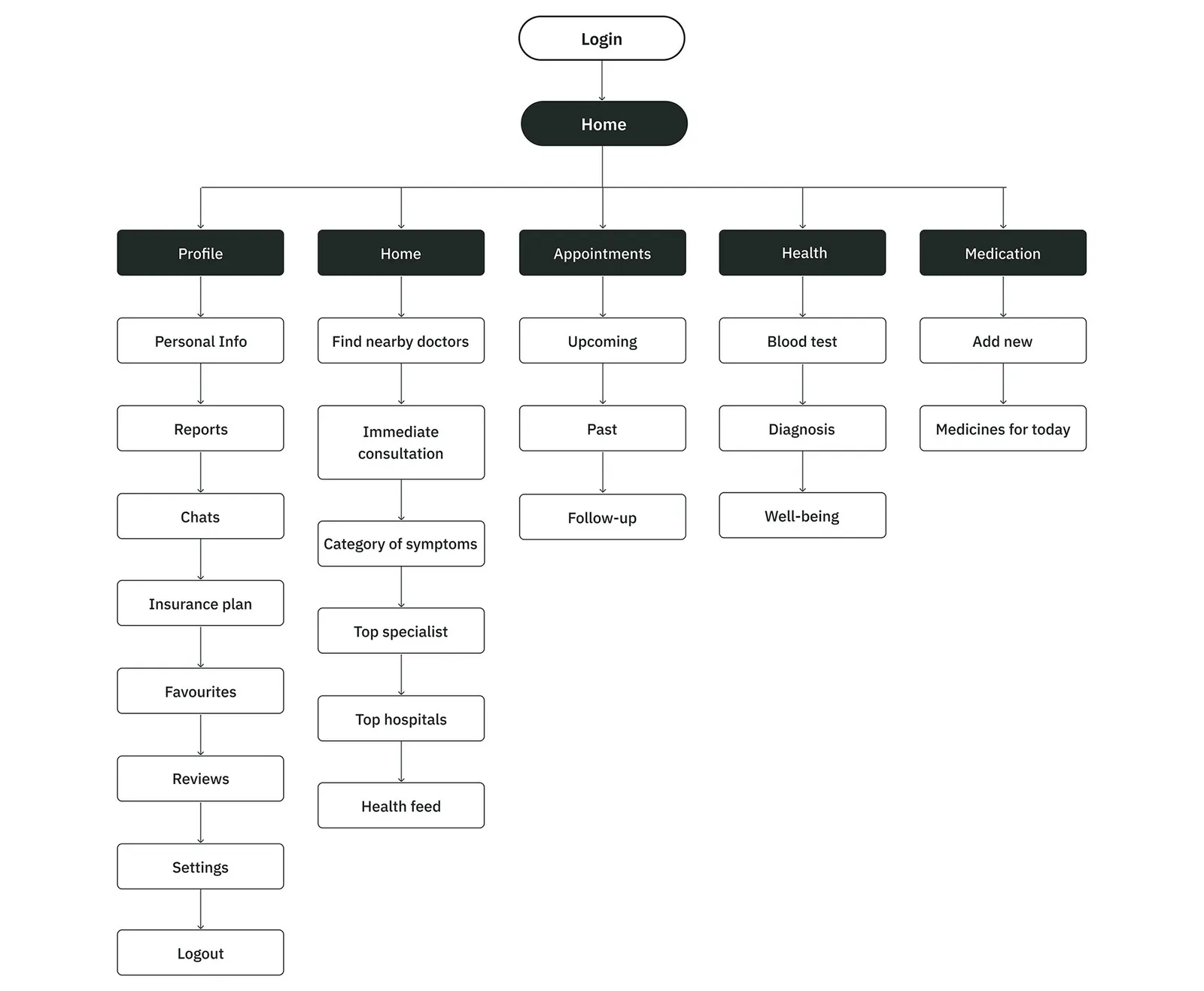
After login the app splits into 5 sections: Profile, Home, Appointments, Health and Medication. Home holds nearby doctors, immediate consultation, symptom categories and top specialists.
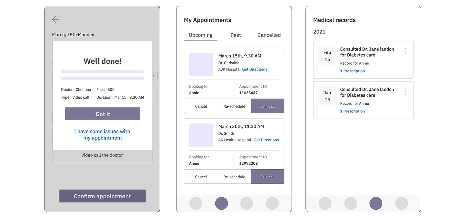
Booking fits the 3 to 4 step target. You pick a date on the doctor's profile, a time and consultation type (message, call or video) on the next screen, then confirm.
Finding a doctor by language was the most common interview complaint, and the search filter lists English, Hindi, Tamil and Telugu.
Wireframes
I laid the app out in 14 numbered low-fidelity screens, from splash and login to chat with a doctor.
After booking, the appointments tab lets you re-schedule or join the call, and the health tab keeps each consultation with its prescription, so Annie's records live in one place.
Design
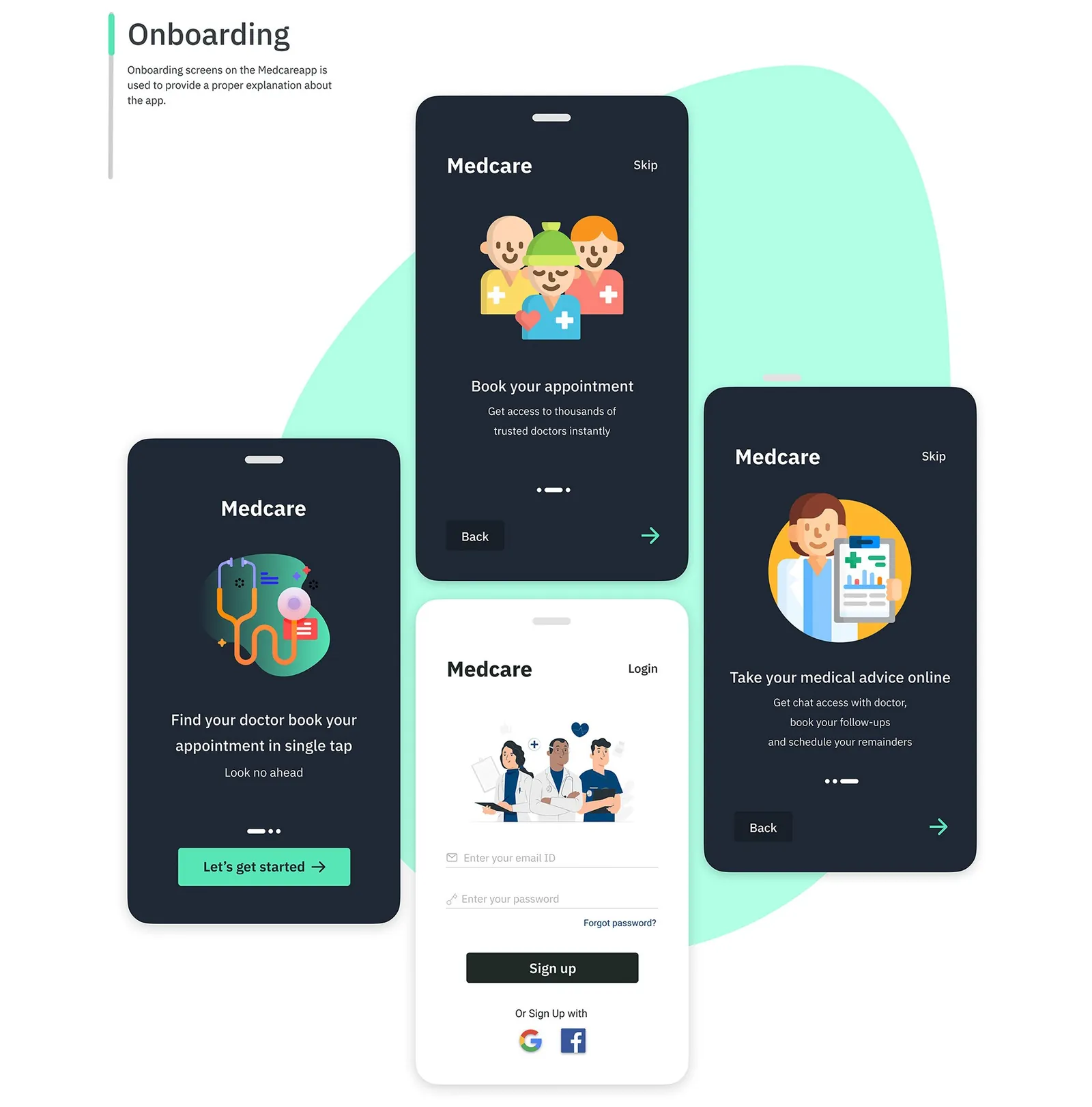
The look is mint green (#58E5B6) on near-black (#202926), with grays and a pale lavender as secondary colors, set in IBM Plex Sans.
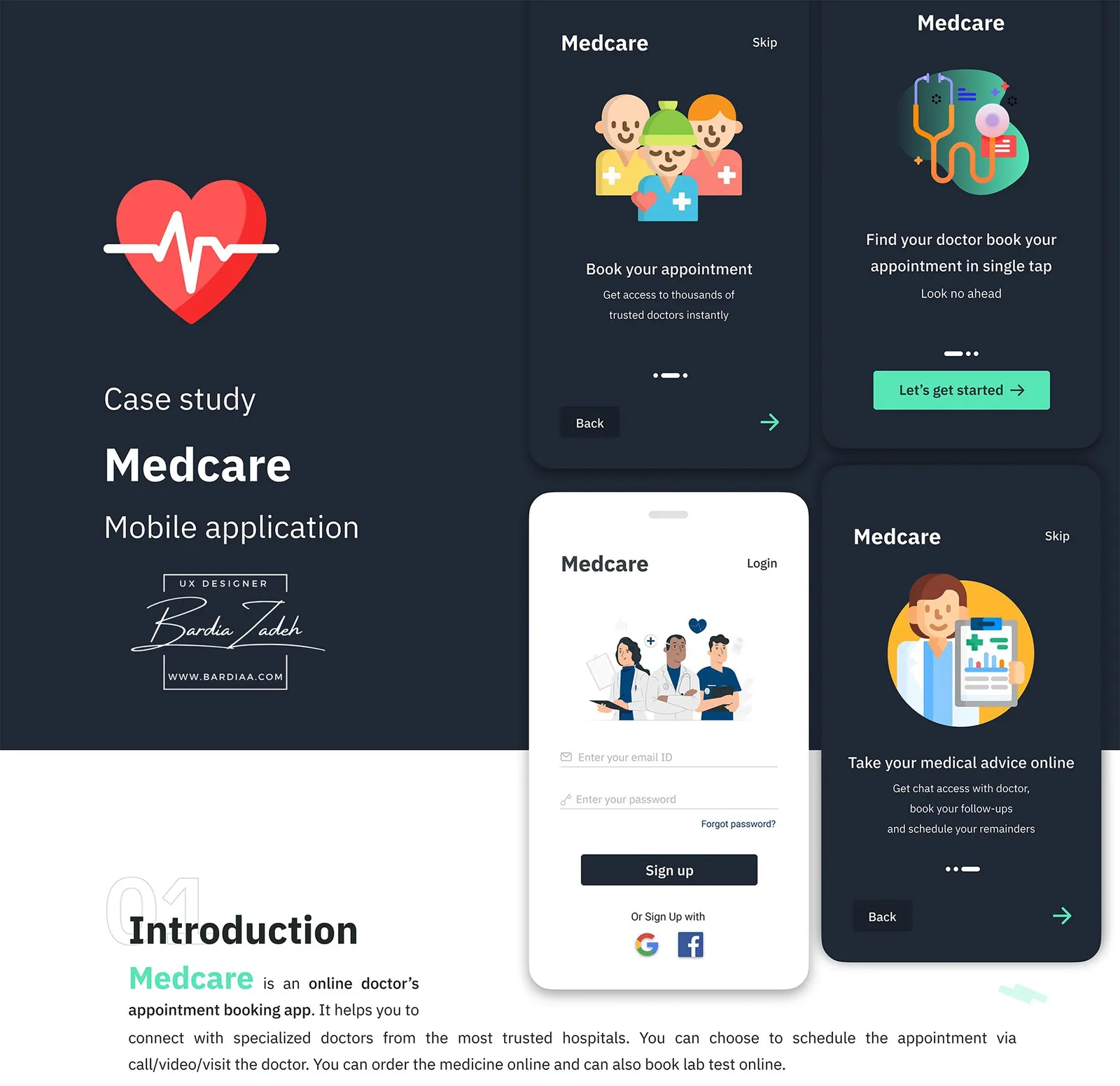
In high fidelity I designed the onboarding: 3 dark cards that explain what the app does, then a light login screen with Google and Facebook sign-up.
This study comes from my earlier portfolio, where it was one long image. I rebuilt it as a readable page in 2026; the figures are the original slides.