
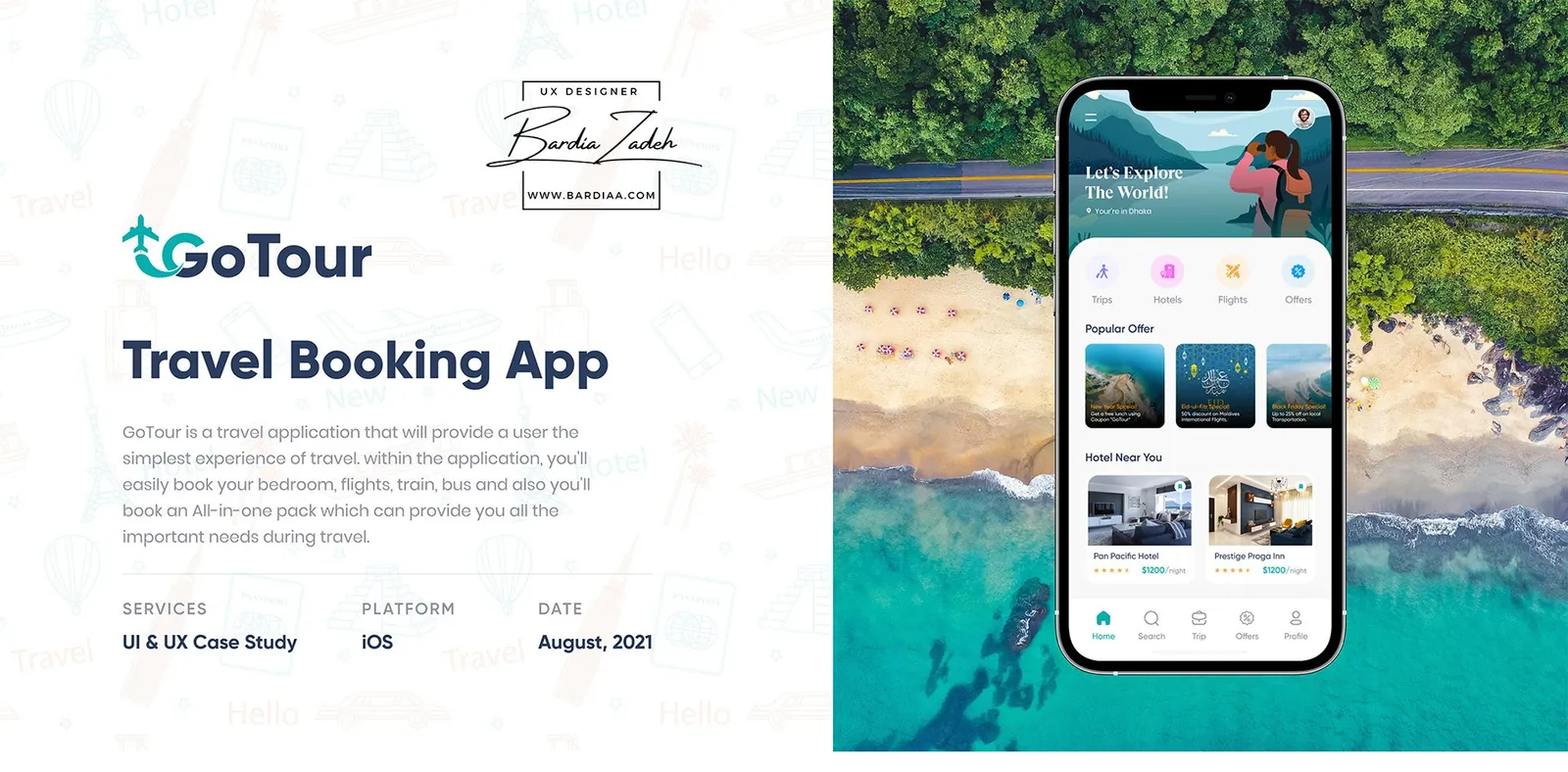
Methods
- User interviews
- Survey
- Problems and solutions
- Persona
- Empathy map
- Card sorting
- User flow
- Wireframes
- Colors and typography
- Visual design
The problem
GoTour started with my own frustration. In college, every trip meant going to a travel agent's office a long way from home, and the agency took a commission on the ticket.
So why have a middleman at all? Cut out the agent and the ticket gets cheaper, and nobody has to travel just to book travel.
I mapped out 6 problems and paired each with a fix. Fake tour buses and hotels called for real photos of the bus and the room. A hotel in the wrong spot called for map directions to the exact location. Safety worries got customer care on call.
Research
We interviewed 8 or 9 users about how they plan and book a trip, and what they need once they're traveling. A survey filled in the numbers.
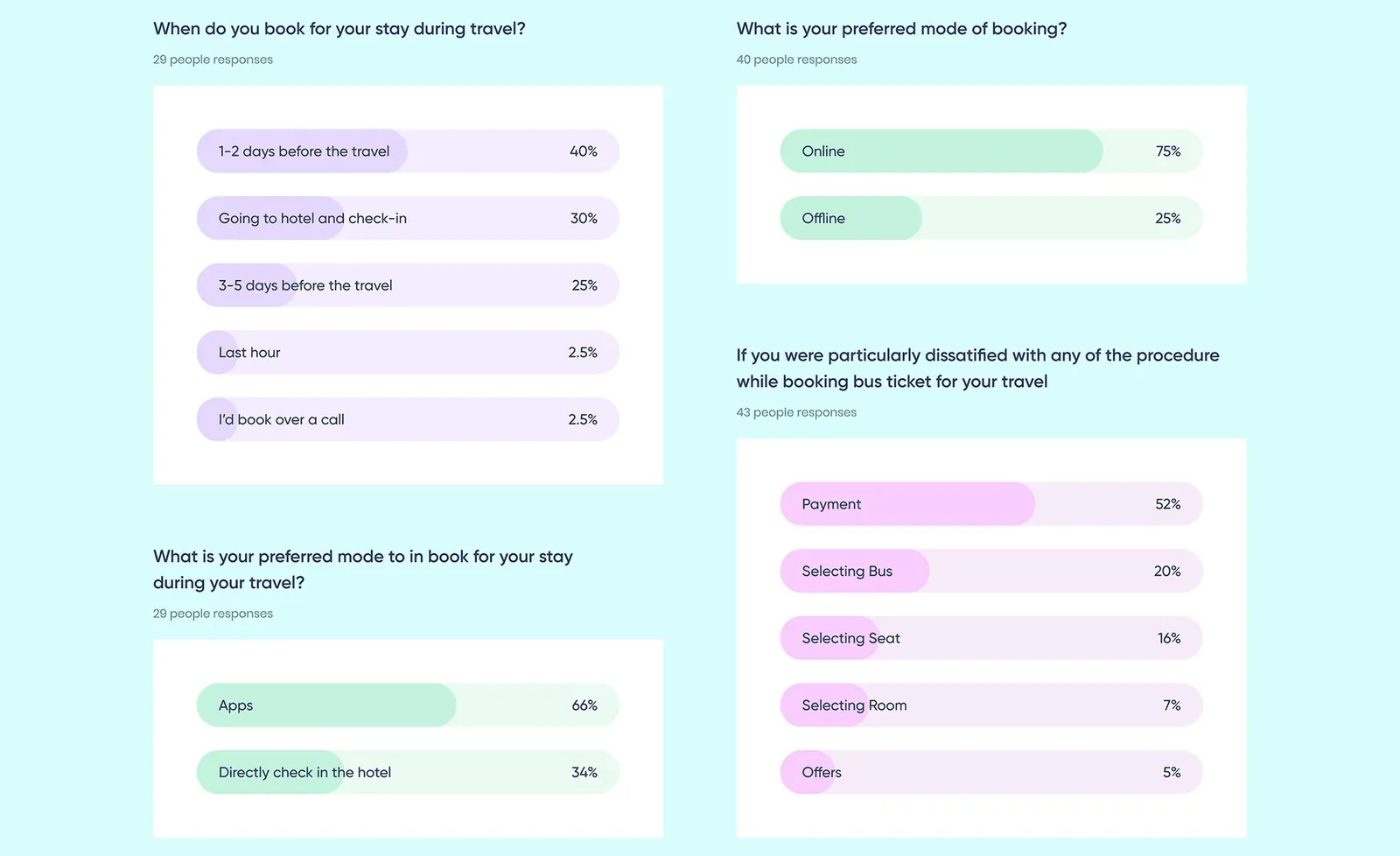
People already book online and want an app for it. They also book late: 40% sort out their stay 1 to 2 days before they travel, and another 30% just turn up at the hotel.
Bus was the most common way to travel (36%), and payment was the sore spot there. Of the people unhappy booking a bus ticket, 52% named payment, way ahead of picking a bus (20%) or a seat (16%). And 54% said they'd like to book the hotel and the ticket together as one package.
Who it's for
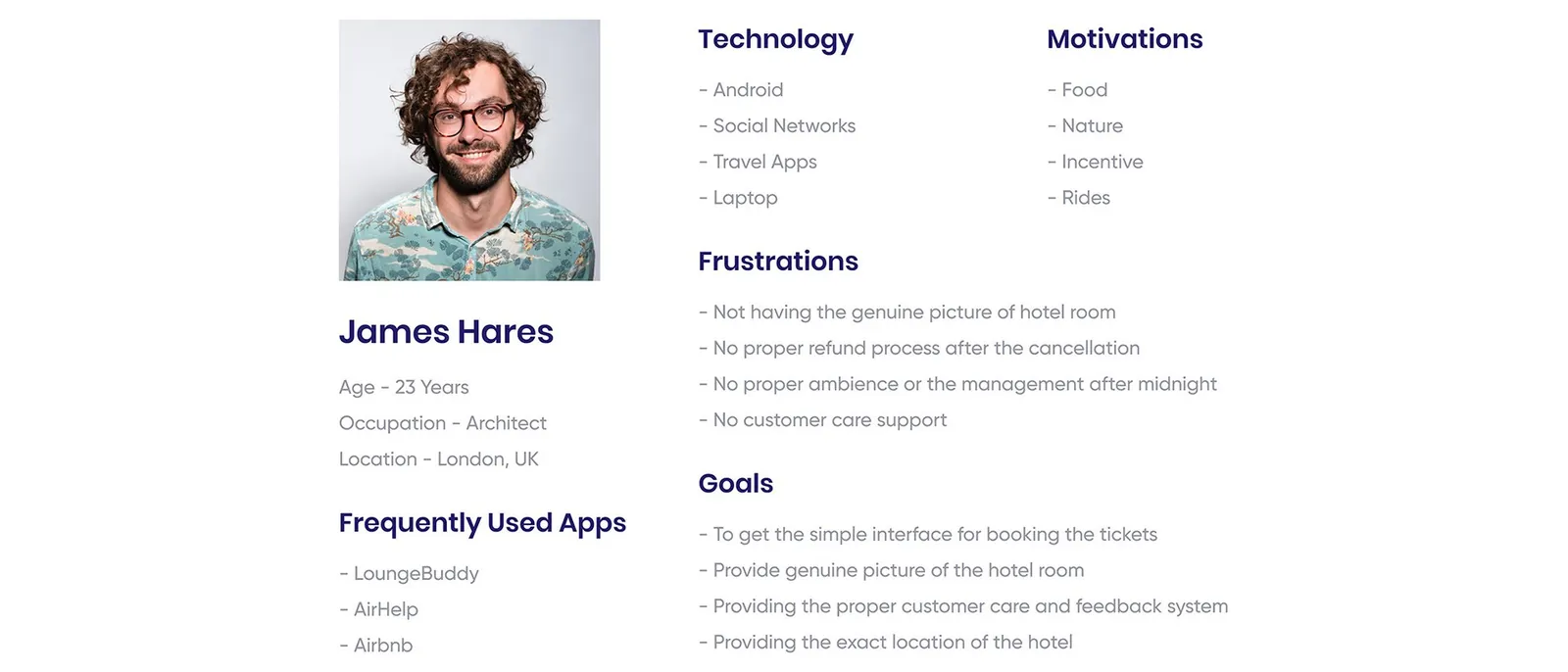
My persona, James Hares, is a 23-year-old architect in London who already uses Airbnb, AirHelp and LoungeBuddy.
His frustrations echo the problem list: no genuine photos of the room, no proper refund after a cancellation, poor management after midnight and no customer support. He wants a simple way to book tickets, real room photos, proper customer care and the hotel's exact location.
The empathy map added the feelings around a trip. People want a good place to stay and don't want to miss anything about a place. They also hear that adventurous spots are riskier and that the network can drop out there.
Card sorting
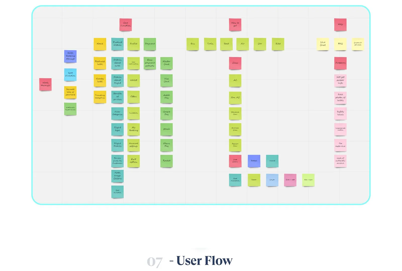
Card sorting gave the app its structure. The board settled into core functions (home, product details, profile, payment), how to get there (bus, train, boat, air, car or bike, down to class and seat) and help (live chat, FAQ, customer service).
The help column also collected what goes wrong: fake hotel photos, safety issues, prices that are too high and a lack of authentic reviews.
User flow
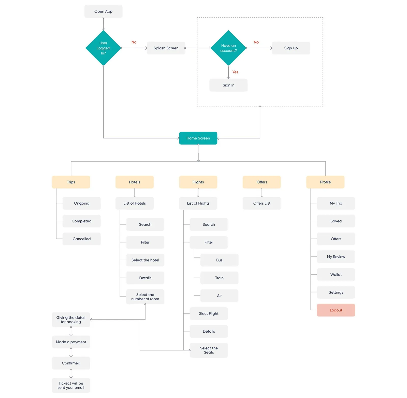
Everything hangs off the home screen. After sign in or sign up, Home branches into 5 areas: Trips, Hotels, Flights, Offers and Profile.
Hotels and flights each get their own search, filter and select steps. Then both end the same way: booking details, payment, confirmation, and the ticket sent by email.
Wireframes
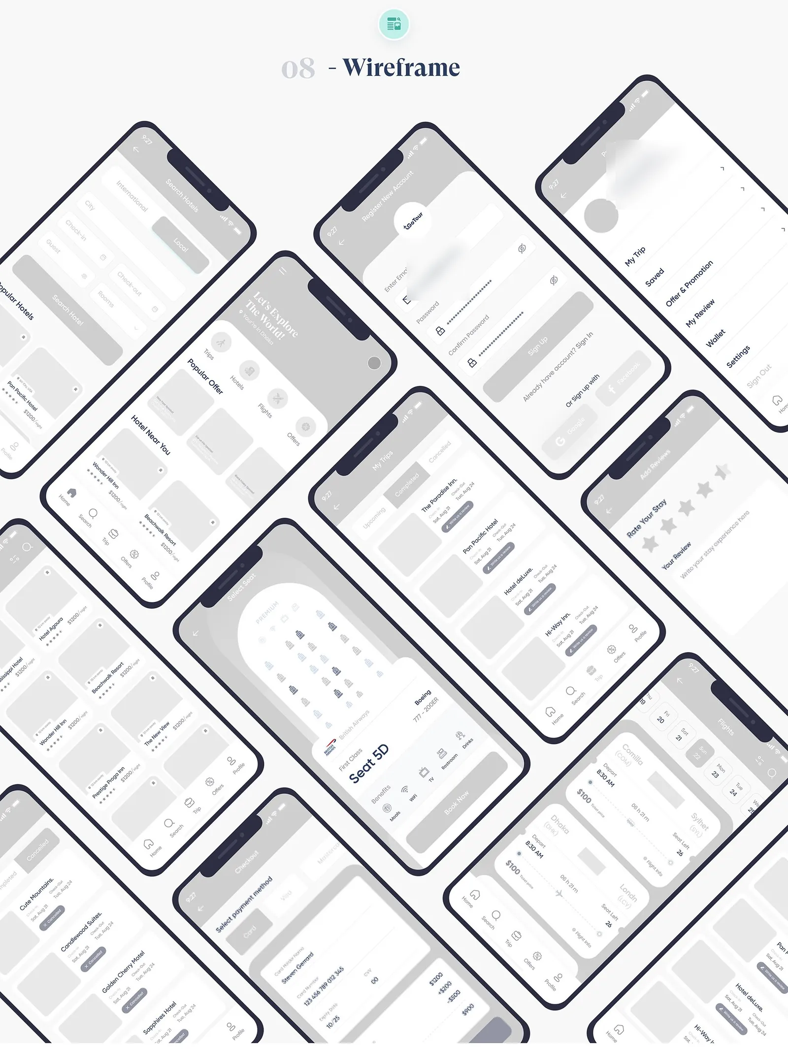
I wireframed the main screens in grayscale first, including hotel search, home, sign up, my trips, reviews, seat selection, flight results and checkout.
Visual design
The look runs on 2 brand colors. Teal #07AEAF is the sky and the ocean, calm and trustworthy for an app that gives people information. Orange #FE9900 brings the energy. Type is Poppins and Gilroy.
You can spot the early fixes in the screens. Hotel pages open on a photo gallery with a Direction link, upcoming trips have For Help and Direction buttons on every booking, and past stays get a star rating and a written review.
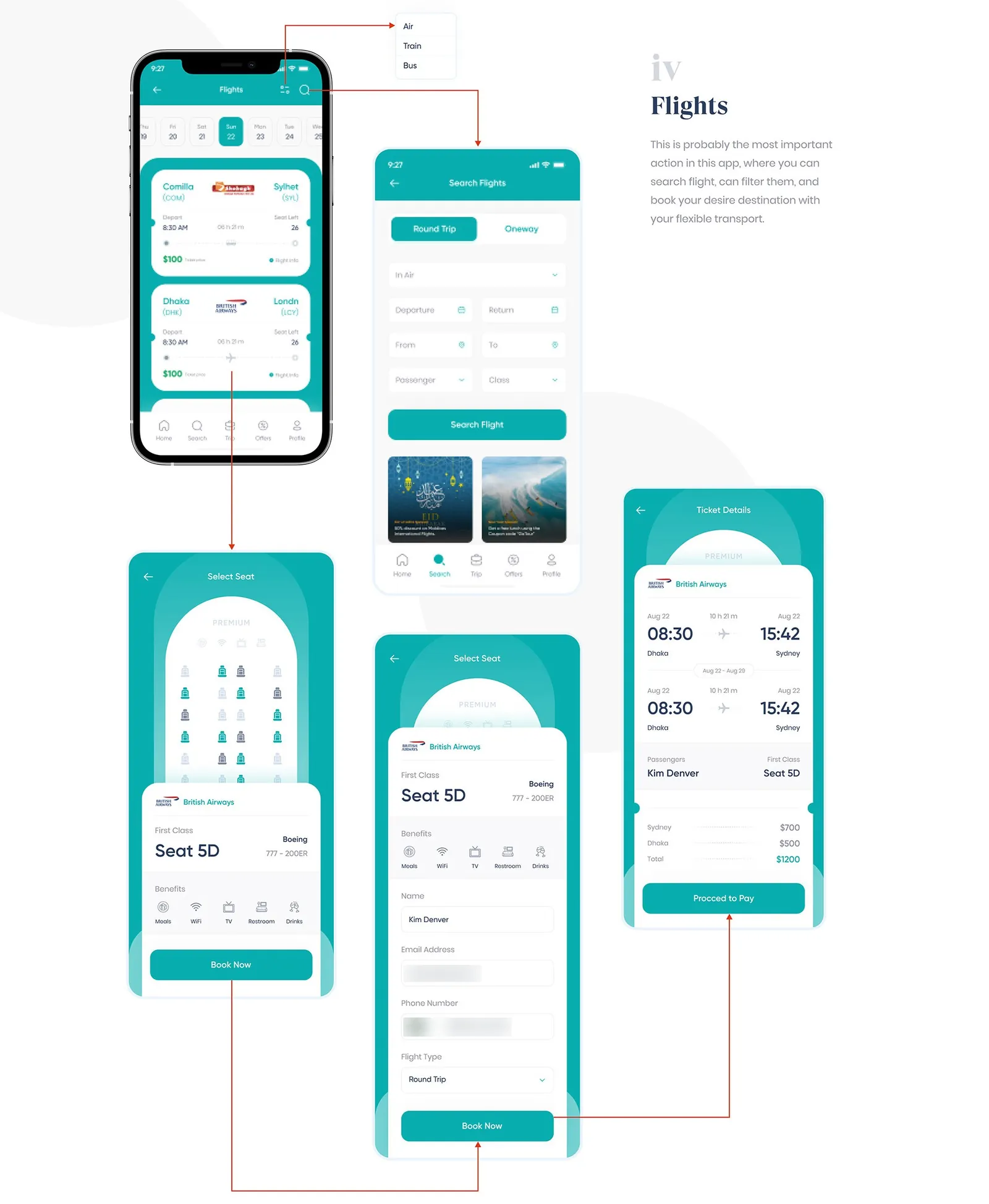
Flights is probably the most important action in the app. You search round trip or one way, filter by air, train or bus, pick a seat from the seat map, check the ticket details and pay.
This study comes from my earlier portfolio, where it was one long image. I rebuilt it as a readable page in 2026; the figures are the original slides.