
Methods
- SWOT competitive analysis
- User interviews
- Qualitative analysis
- Quantitative analysis
- Persona
- Journey map
- Flow chart
- Low-fidelity wireframes
- Style guide
- High-fidelity design
The problem
A fleet owner wants to spend less on accidents and breakdowns. To get there, they need to see how their drivers drive and whether each truck gets inspected.
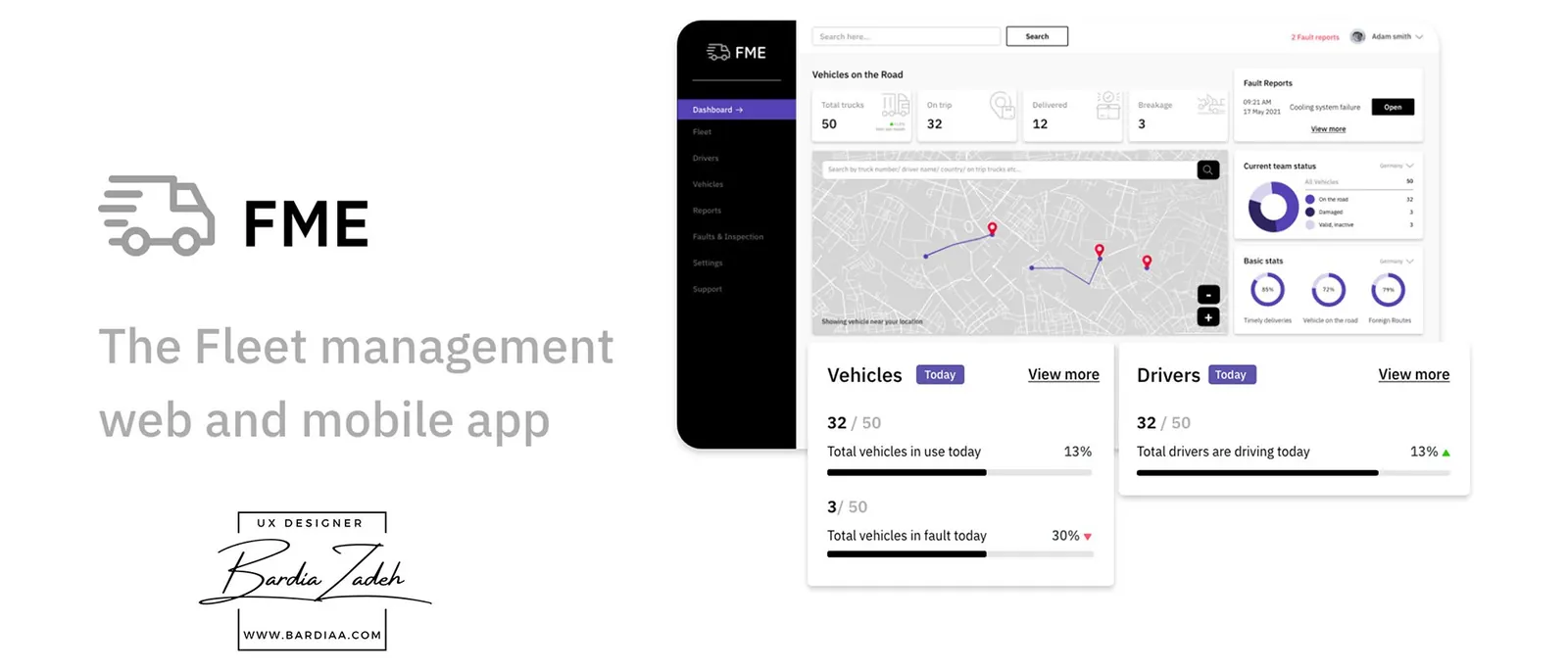
FME (Fleet Management Europe) is 2 apps. Drivers file a DVIR (driver vehicle inspection report) in a mobile app before and after every trip and check their driving score. The owner's web dashboard uses that data, plus GPS and telematics, to watch how each person drives and send back tips and training videos.
It was an end-to-end design assignment, so there's no launch or usage data here.
Research
The gap in existing products was on the driver's side. My SWOT on Whip Around and Samsara found neither had a scoreboard or leaderboard for drivers, or a driving team to call in an emergency. Some apps gave the owner no way to contact the driver at all.
Then I interviewed fleet owners and truck drivers. I asked owners if they could see their trucks' DVIRs easily, and drivers if good driving ever earned them anything.
The answers kept coming back to paperwork. Owners struggled to see inspection reports and drivers struggled to file them.
Who it's for
I made 2 personas, one per app. Adam is a 35-year-old fleet owner running 50 trucks across 5 European countries, and he finds it hard to get tips out to every driver.
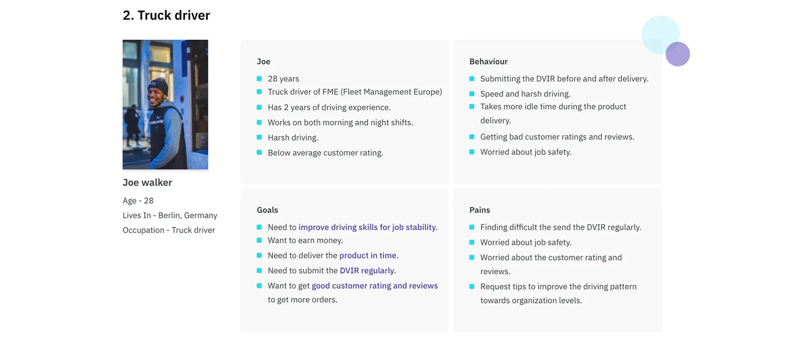
Joe is a 28-year-old driver with 2 years of experience, harsh driving habits and a below-average customer rating. He wants job stability and better reviews, and he asks for tips to improve.
Journey map
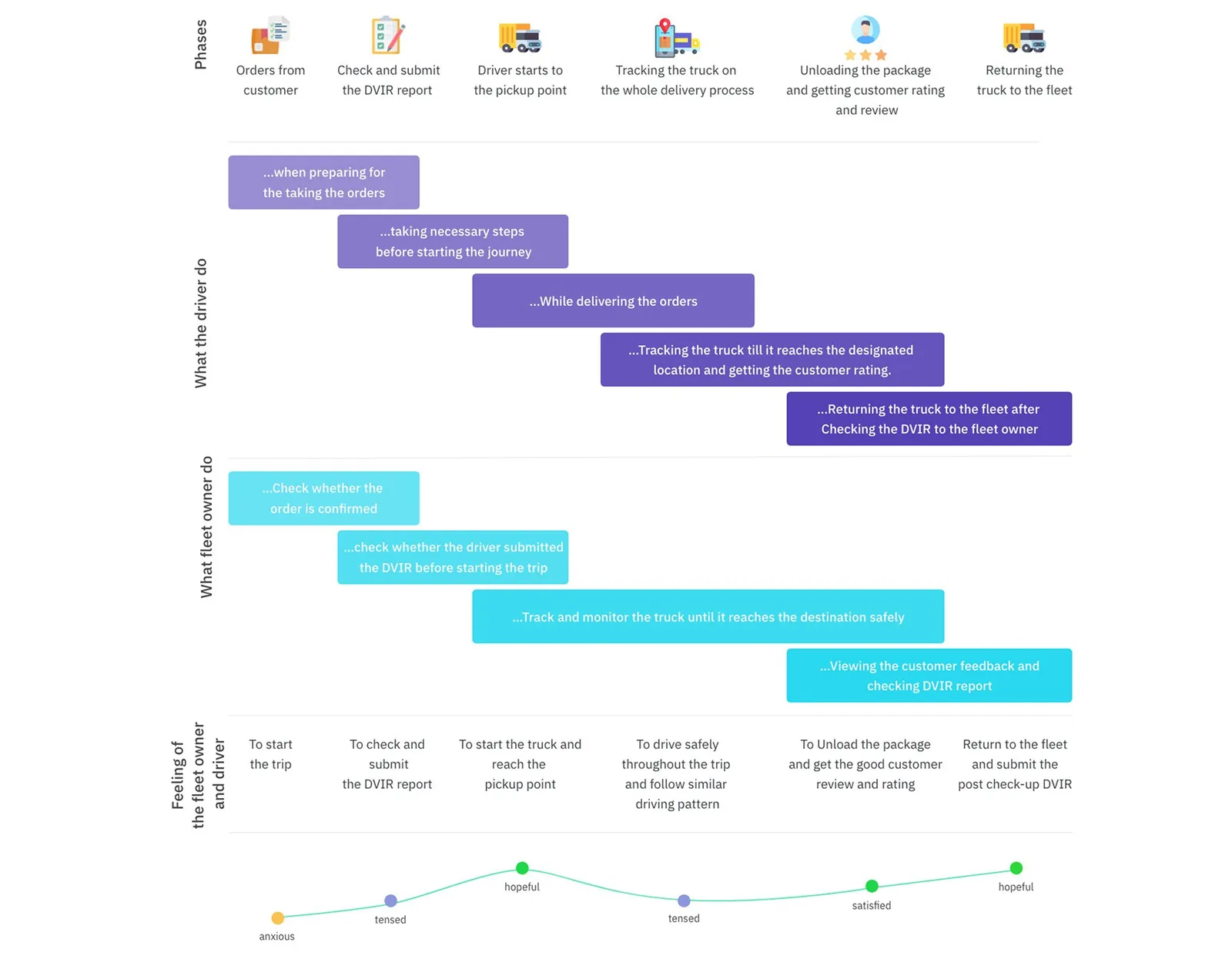
The journey map follows one delivery in 6 phases, with the driver and owner side by side. The mood turns tense at the DVIR step and again on the road.
Under each pain I wrote an idea, like filing the DVIR in the app and tracking driving behavior with GPS and telematics.
Flows and structure
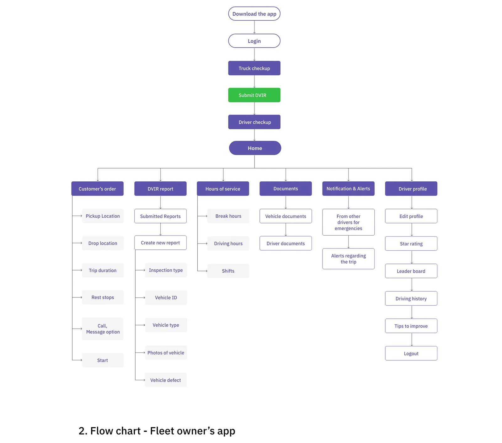
In the driver app, inspection comes first. After login the driver goes through a truck checkup, the DVIR and a driver checkup before reaching Home. Home branches into the order, reports, hours of service, documents, alerts and a profile that holds the leaderboard.
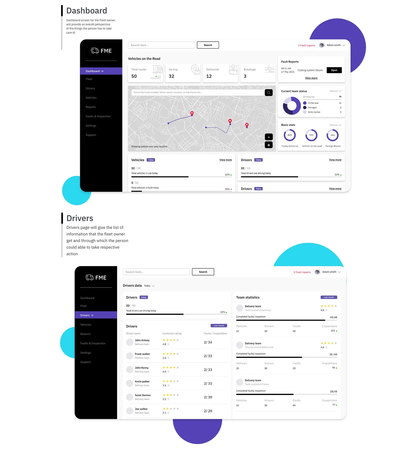
The owner's web app has 6 sections, and Drivers is where the owner adds tips, guides and training videos.
Wireframes
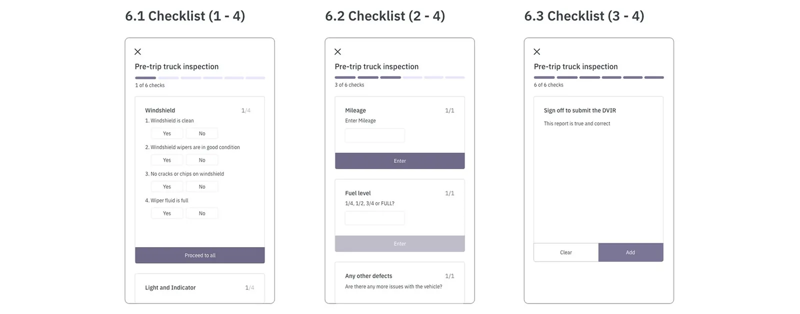
I wireframed the pre-trip inspection as 6 short checks with a progress bar: yes or no questions for parts like the windshield, fields for mileage and fuel level, then a sign-off that the report is true and correct. The route screen got an SOS button.
Driver app
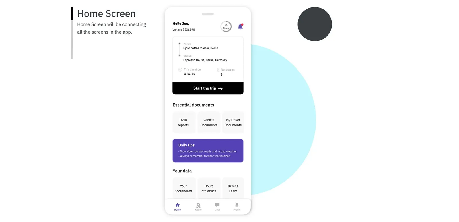
Home is the hub of the driver app. It shows today's trip with a Start the trip button, the driver's score, daily tips, documents and shortcuts to the scoreboard.
The scoreboard gives a weekly score (65 for Joe in the mockup) broken into 4 parts, including hard braking and speeding. After each delivery, a success screen shows the customer's star rating and review.
The style guide is short: black and purple (#5442B5) as primary colors and IBM Plex Sans for type.
Fleet owner dashboard
The dashboard puts what the owner has to deal with on one screen: trucks on the road, a searchable map, open fault reports and basic stats like timely deliveries.
The Drivers page lists each driver's customer rating and faults against inspections, and compares the country teams. Joe sits in the last row with a 2.1 out of 5, which fits his persona.
Looking back
This project pushed my research skills the most. It felt hard early on and got smoother once I got familiar with what owners and drivers needed.
This study comes from my earlier portfolio, where it was one long image. I rebuilt it as a readable page in 2026; the figures are the original slides.