
Methods
- Problem definition
- User activity tracking
- Question design
- Survey
- Competitor analysis
- SWOT analysis
- Persona
- Empathy map
- User flow
- Task flows
- Information architecture
- Paper sketching
- Wireframes
- Style guide
- High-fidelity design
The problem
Seeing a dentist took effort before you even reached the chair. Patients couldn't tell which dentists were any good, and their place in line was a serial (the appointment queue) that a serial taker usually kept in a notebook.
Afterwards, prescriptions went missing and bad handwriting could mean taking the wrong medicine. If something went wrong after treatment, there was no emergency support to turn to.
Dentists struggled to keep a schedule without a booking system, and they had no statistics on their patients or on whether those patients were satisfied. So we set two goals: easy booking with live consults over audio, video or text for patients, and a smarter way for dentists to manage patients and their schedule.
Research
We mapped what patients and dentists do before, during and after treatment, then wrote a separate question set for each side.
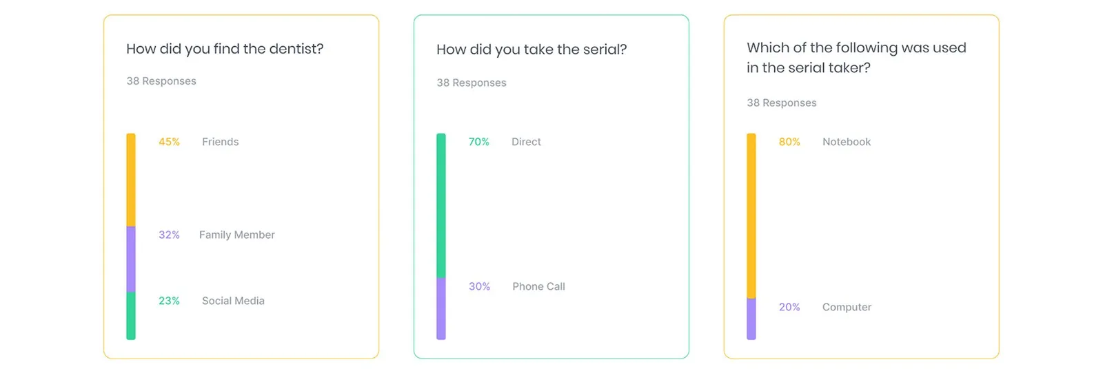
The patient survey got 38 responses, and it backed up the paper-queue picture. 70% took their serial in person and 30% by phone. 85% got no reminder before a consultation, and 80% had never taken a dental service online. 48% had seen a doctor break the serial and see someone out of turn.
We also compared four existing dental services question by question and ran a SWOT on each. All four were paid, listed web as their platform and took bookings by phone. One had no app and no telemedicine at all. Our own SWOT read the gap the same way: competition in online dental service was low and patient demand was high.
Who it's for
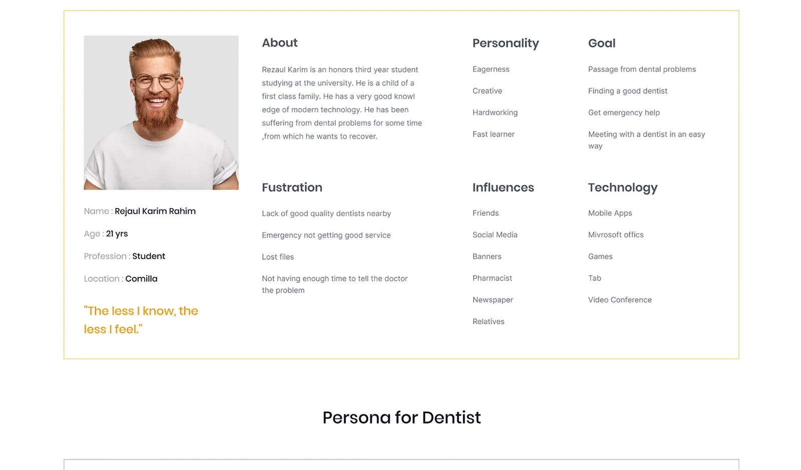
Two personas came out of this. Rejaul is a 21-year-old student in Comilla who wants a good dentist and help in an emergency. Lost files and too little time to explain his problem frustrate him.
Saiful is a 40-year-old dentist in Dhaka who also teaches. He wants to reach distant patients online, but most of his patients have no idea what telemedicine is.
Each persona got an empathy map. On the patient side, time kept showing up: big serials waste it, and meeting on time was the gain.
Flows and structure
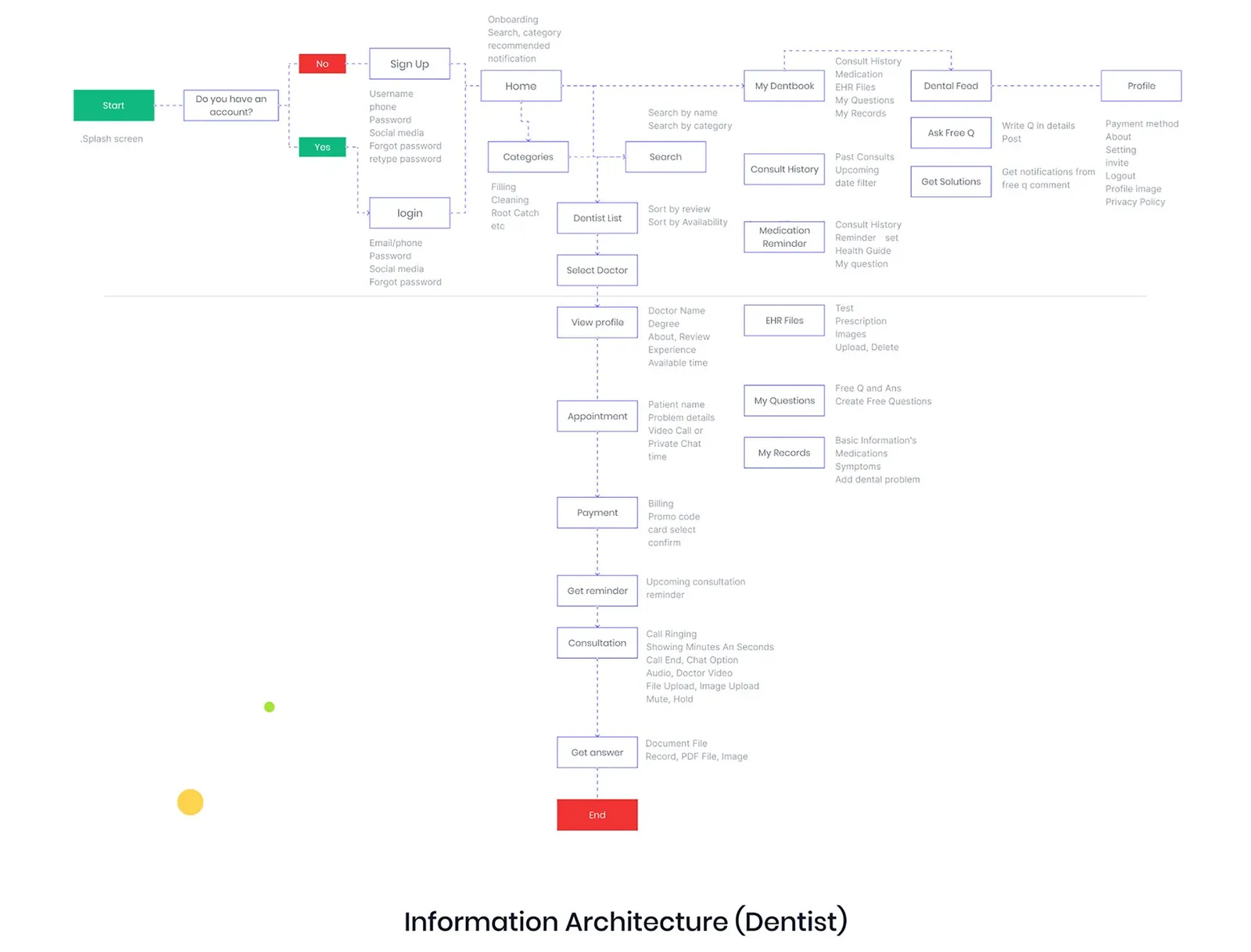
We drew user flows, task flows and the information architecture separately for each side. For patients, home branches into search, My Dentbook, the Dental Feed and the profile.
Booking runs from the dentist list to a profile, an appointment, payment, a reminder and then the consult. The free question flow shows similar questions first, so a patient only posts when theirs hasn't been answered yet.
Sketches and wireframes
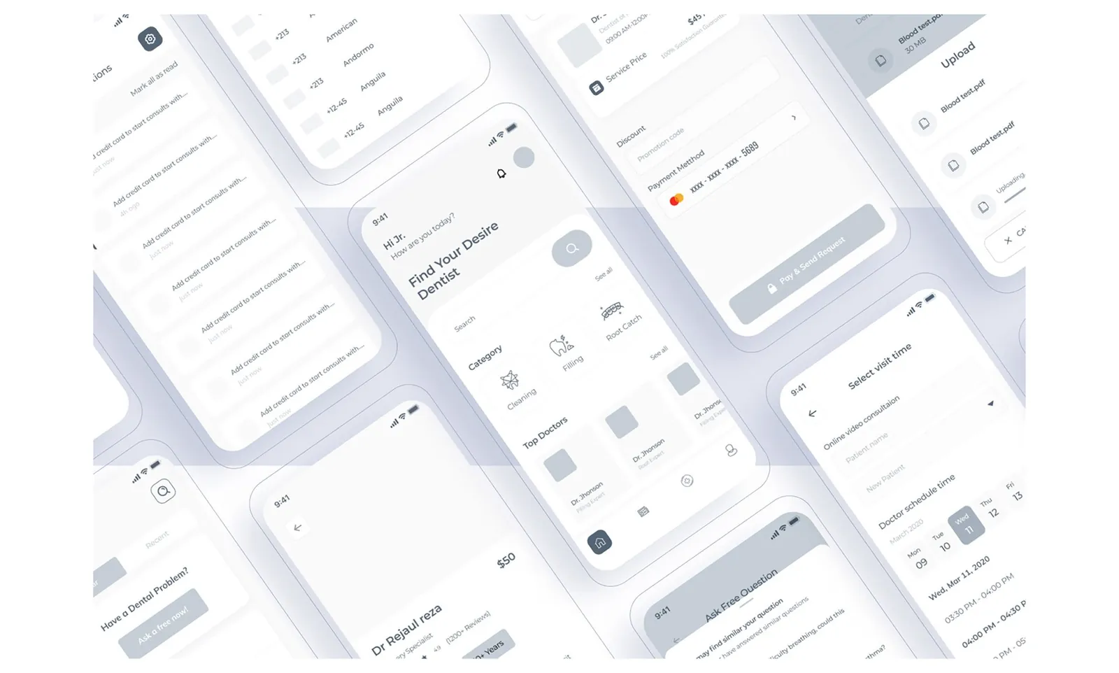
We sketched the main patient screens on paper, then moved to grey wireframes for home, the dentist profile, picking a visit time, payment and file upload.
Design
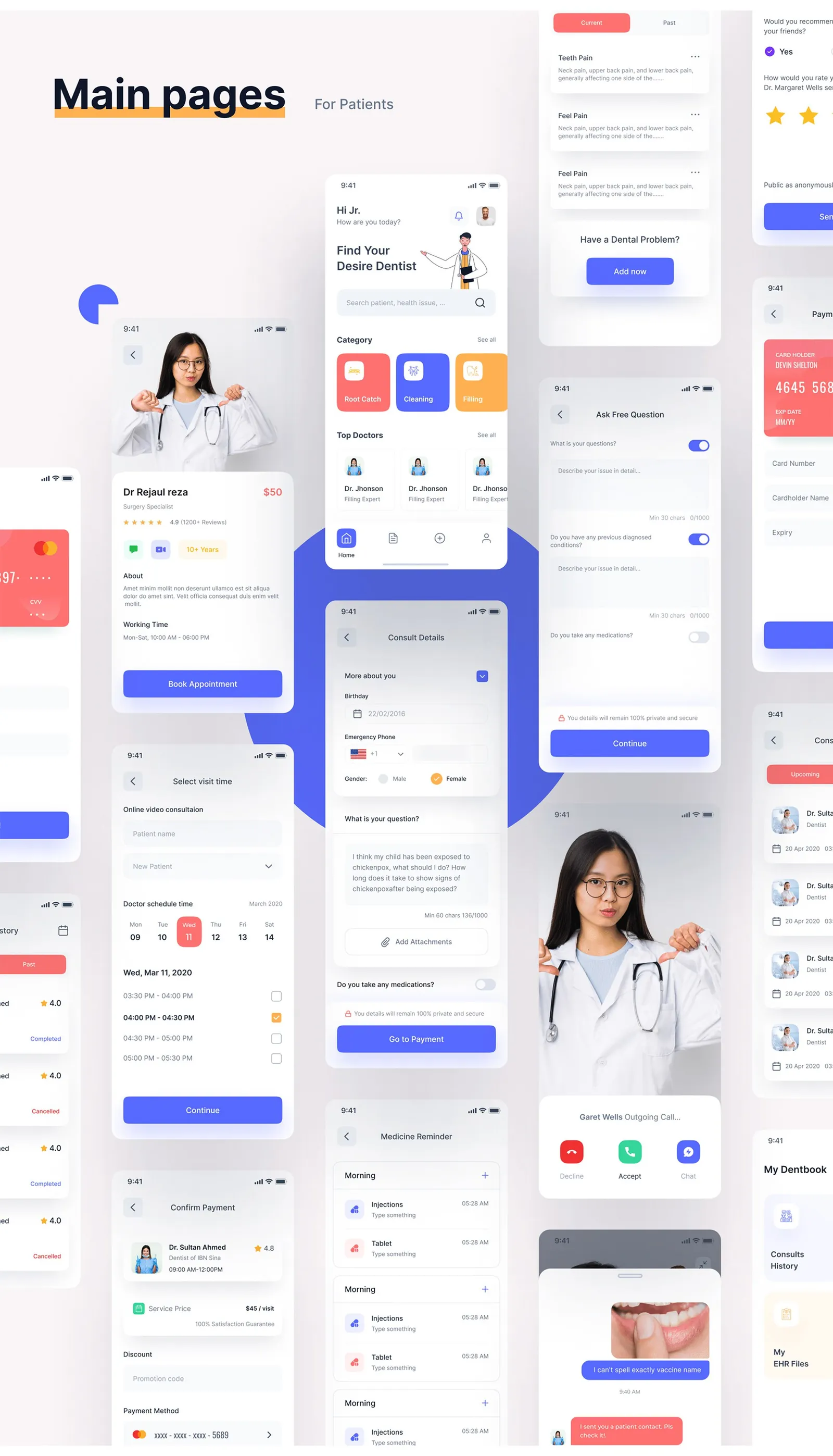
I kept the visual system small: Inter in four weights, a blue primary (#5669FF), coral and orange accents, and a dark navy (#0F172A).
Patients land on search, treatment categories and top doctors. Booking goes profile, visit time, consult details with attachments, then payment. My Dentbook keeps consult history, medicine reminders and EHR files for tests, prescriptions and images, which goes straight at the missing-prescription problem.
The dentist side
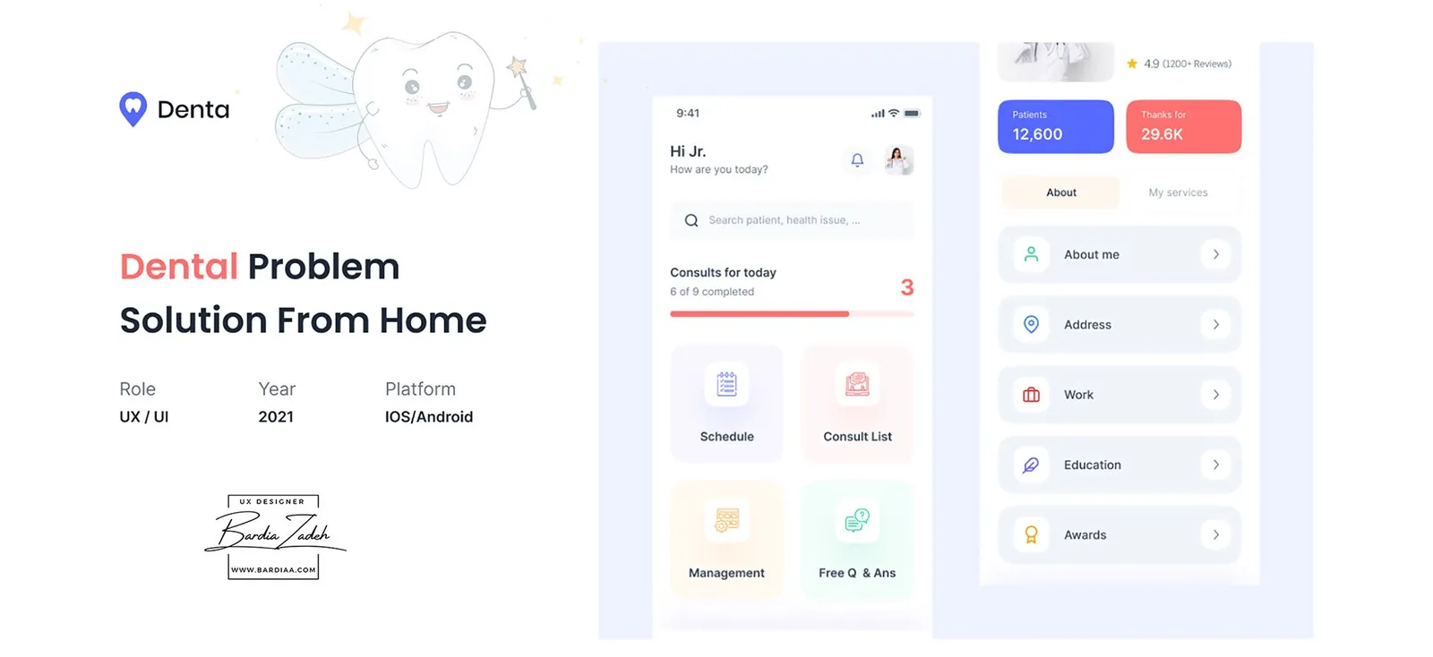
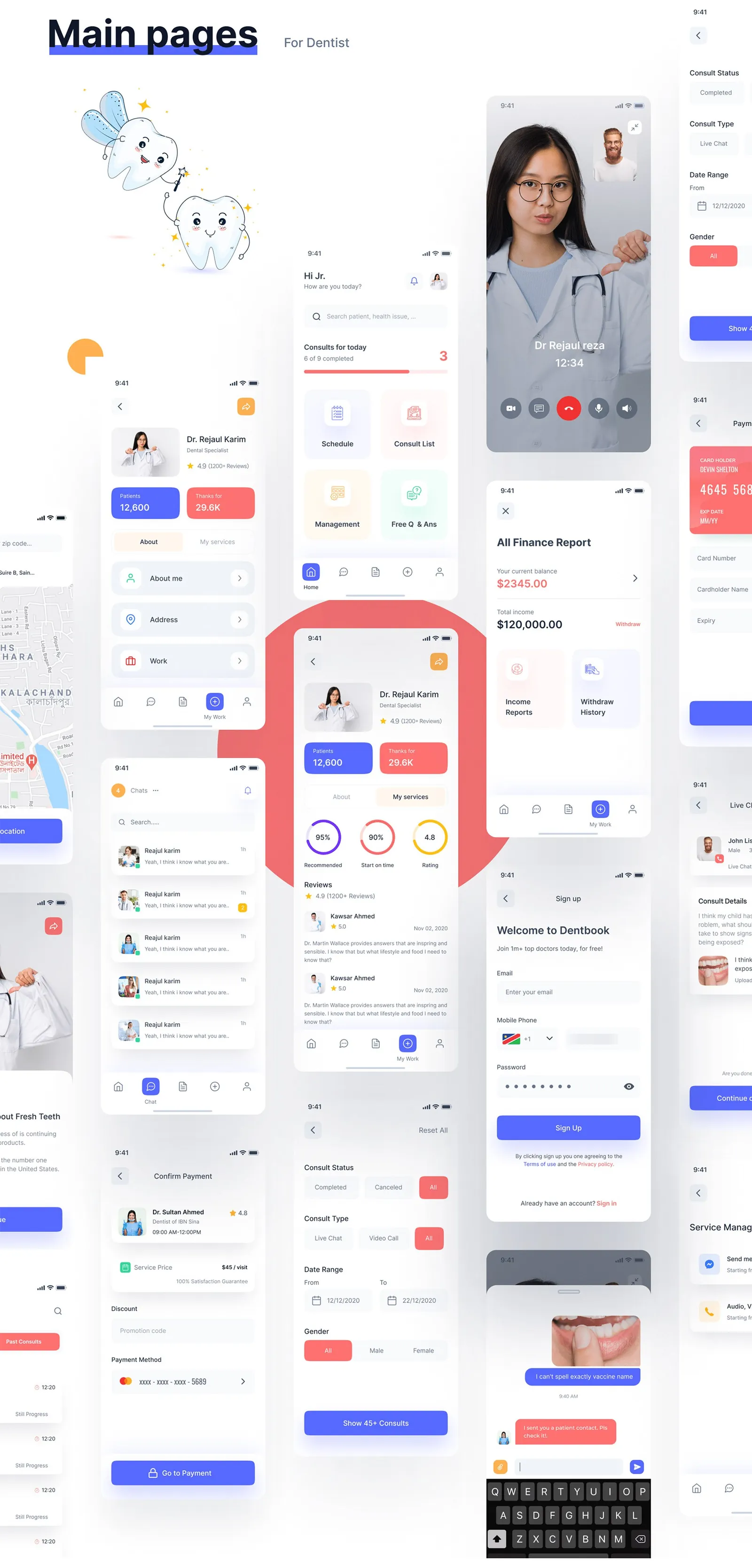
Dentists sign up and apply for verification with their basic info and work profile, or skip it for later. Home shows today's consults and progress, with shortcuts to schedule, consult list, management and free Q&A.
From there they answer free questions, post tips to the feed, take video calls and chats, and track income and withdrawals in a finance report. A filter narrows consults by status, type, date and gender.
This study comes from my earlier portfolio, where it was one long image. I rebuilt it as a readable page in 2026; the figures are the original slides.