
Methods
- Survey
- Competitor analysis
- Provisional persona
- Persona
- Empathy map
- User flow
- Visual language
- High-fidelity design
The problem
People get health advice from everywhere and have no easy way to check it, or to reach the right specialist at the right time. Doctors have the opposite problem: they often don't have the patient's medical history, so every visit starts from scratch.
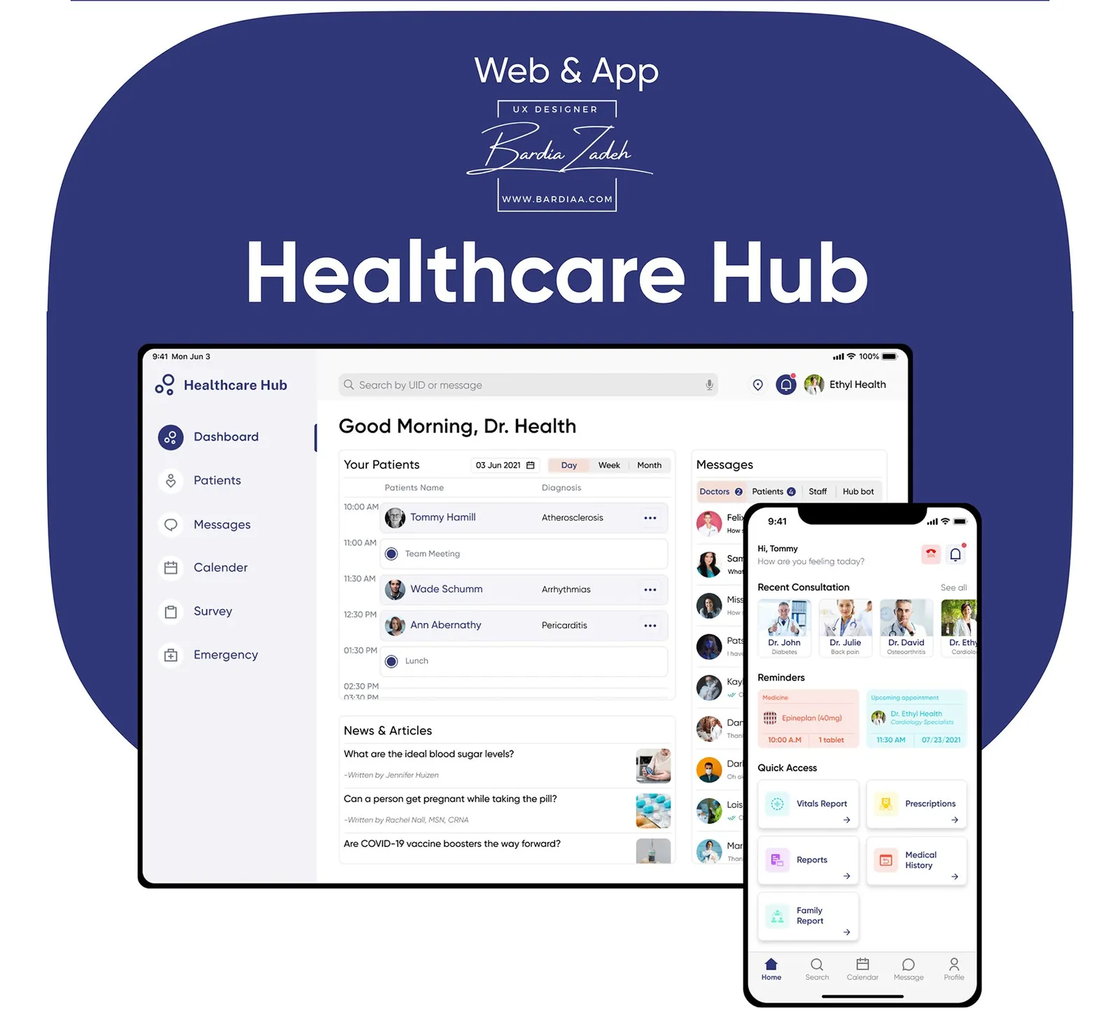
Healthcare Hub connects three roles: the patient, the doctor and the clinic's administrator or receptionist. A patient can send their own data to a doctor and get advice back.
Research
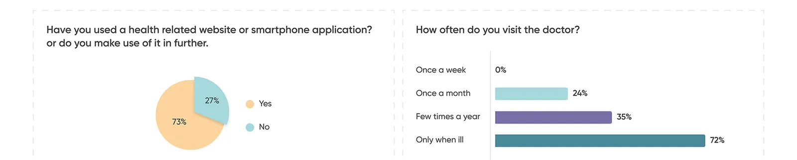
The survey showed that booking and prescriptions mattered most. It mixed quantitative and qualitative questions and aimed at people aged 30 to 70. Respondents didn't like waiting in line beside sick patients, and they'd rather avoid the pharmacy when they're ill.
We also compared Practo, Tata Health and TeleDoctor24. Practo's fixed consultation fee was a strength, but with no bottom navigation bar its features sat on the home screen or under a hamburger menu. One of the others had no in-app pharmacy.
Who it's for
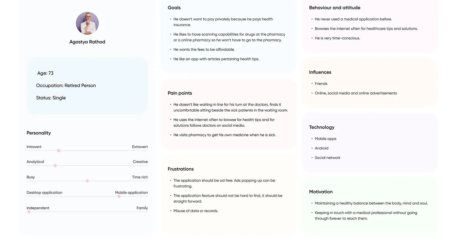
I built the persona around someone who'd never used a medical app. Agastya Rathod is 73, retired, and still walks to the pharmacy when he's sick. He pays for health insurance and doesn't want to pay privately, and he worries about misuse of his records.
The empathy map added a detail I designed for: he has to visit different pharmacies to fill one prescription.
Visual language
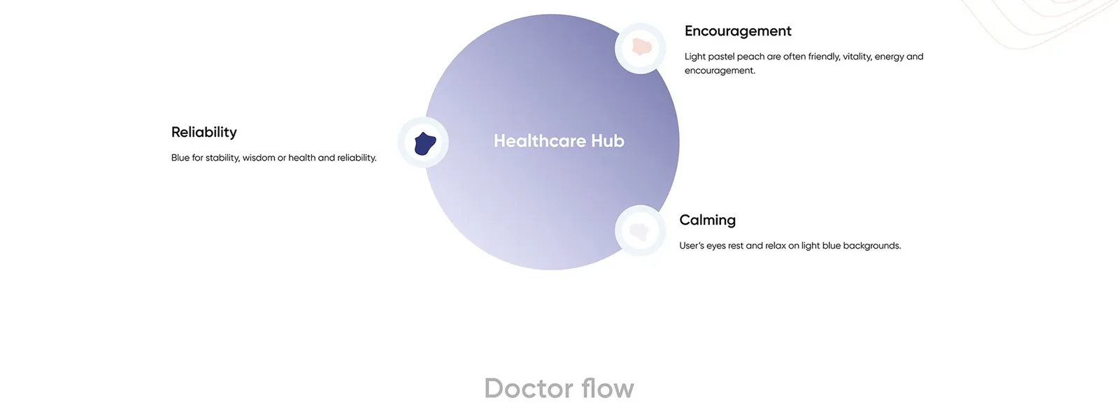
The colors had to feel reliable and calm. I went with a deep blue for reliability, a light pastel peach for encouragement, and light blue backgrounds so people's eyes can rest.
Flows and structure
I split the product into one flow per role. Doctors and admins get a tablet-sized dashboard, and patients get a phone app.
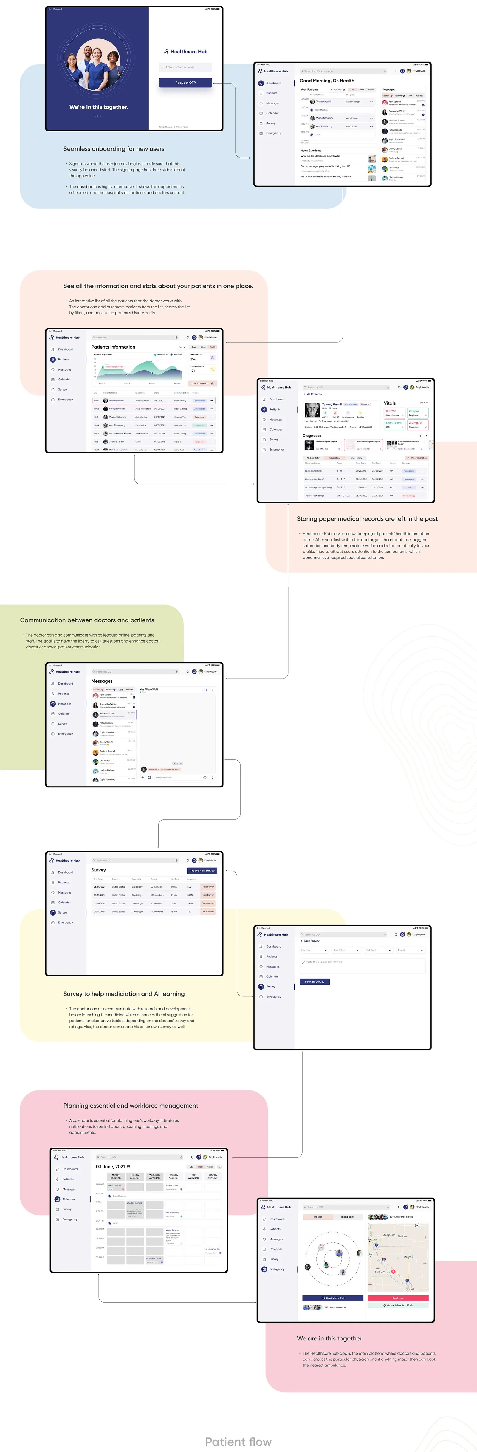
The doctor signs in with a phone number and a one-time code, then lands on the day's appointments and messages. They can filter their patient list, open a record with vitals and prescriptions, and plan the week in a calendar that sends reminders. Vitals from a patient's first visit go into the profile automatically, and I styled them so abnormal readings stand out.
Doctors can also answer research surveys before a medicine launches, which feeds the AI's suggestions of alternative tablets. An emergency screen can book the nearest ambulance.
The patient app
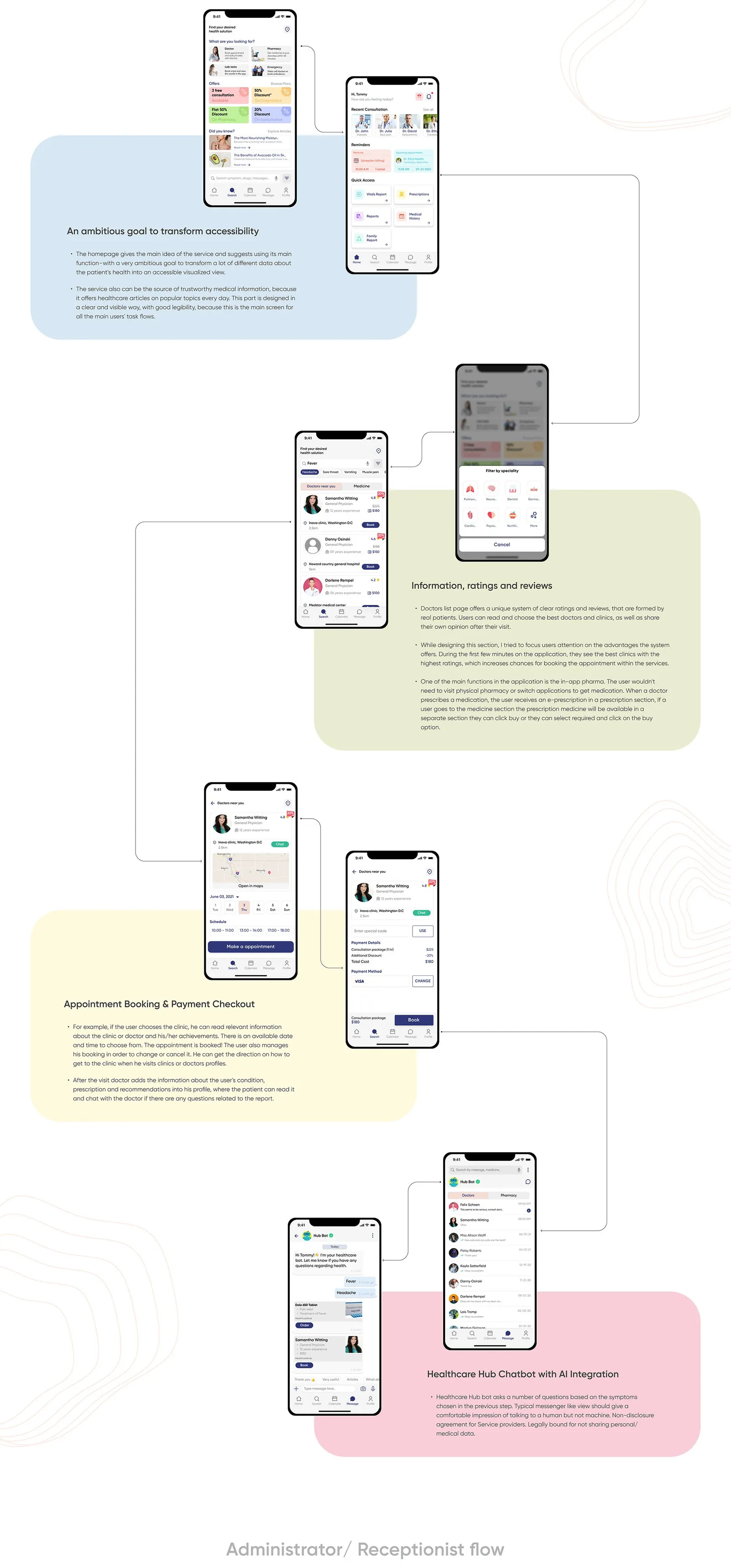
The patient app is built around finding a doctor and getting medicine. Home shows recent consultations, medicine reminders and quick links to vitals and prescriptions, plus new health articles every day.
Search leads to a doctors list with ratings and reviews from real patients, best-rated clinics first. Booking is a date, a time slot and checkout, and the patient can change or cancel it later. After the visit, the doctor adds the patient's condition and prescription to their profile.
Prescriptions land in an in-app pharmacy, so nobody has to visit one or switch apps. Hub Bot, the chatbot, asks questions based on the symptoms a patient picks, in a messenger-style view. Service providers are legally bound not to share personal or medical data, which answers the persona's worry about data misuse.
Admin and reports
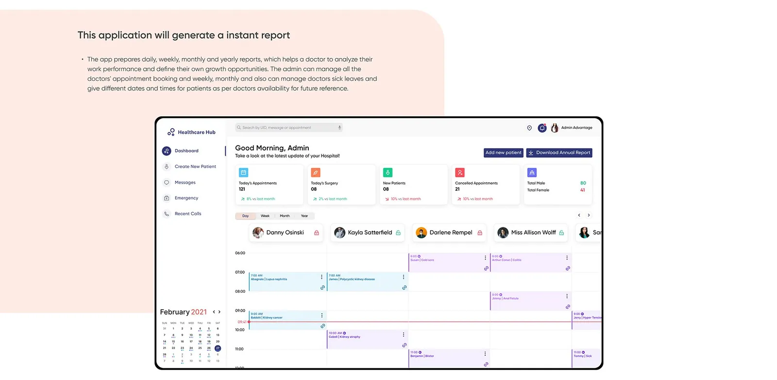
The admin view runs the clinic's schedule. Admins see today's appointments, surgeries and cancellations, manage each doctor's bookings and sick leave, and move patients to new times when a doctor isn't available. The app also builds daily, weekly, monthly and yearly reports.
What I took from it
This project taught me to design within a product's constraints and lean on patterns people already know, since breaking familiar conventions could hurt usability. I also came away thinking the more medical data gets digitized and unified, the more AI can find useful patterns in it, as long as regulation and trust in its results get worked out.
This study comes from my earlier portfolio, where it was one long image. I rebuilt it as a readable page in 2026; the figures are the original slides.