
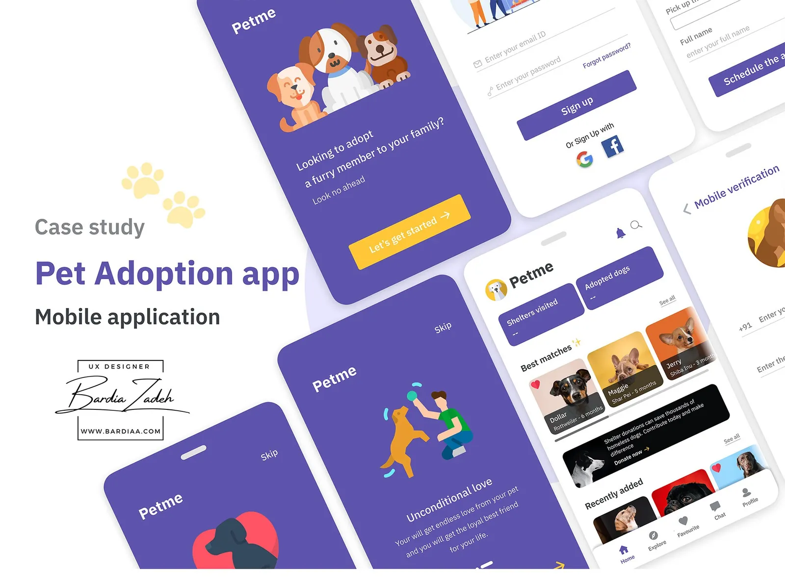
Methods
- SWOT competitive analysis
- User interviews
- Qualitative analysis
- Quantitative analysis
- Empathy map
- User flow
- Wireframes
- Style guide
- High-fidelity design
The problem
Millions of dogs sit in shelters waiting for a home, and adopting one takes too long. The brief was to replace that slow process with a mobile app.
Adopting meant finding a shelter online, hunting for its phone number, booking a visit, doing paperwork, waiting 24 to 48 hours, then a contract, a fee and a trial period. Most shelters are small and can't afford a website, so even step one is hard.
So Petme had two jobs: match adopters with a dog that fits their search and their lifestyle, then make booking a shelter visit easy.
Research
Existing apps and real adopters pointed at the same gaps: shelter contact info and a confusing adoption process. In my SWOT analysis, Pet Store (4.8 stars) had unclear shelter contact details and no search filters. DreamDog (3.7 stars) left out shelter information and left the adoption process unclear.
I focused my own research on first-time and experienced pet owners. People were more hesitant to adopt from a shelter than to buy a pet. They believed shelters were unhygienic, that shelter dogs were often sick, and that older dogs were hard to train and wouldn't bond with a new owner.
The practical pain was talking to shelters and scheduling a visit. Availability was rarely updated, contact details were hard to find, and the paperwork was long.
Who it's for
Petme serves two sides: people who want to adopt, and shelters that want their dogs to find homes.
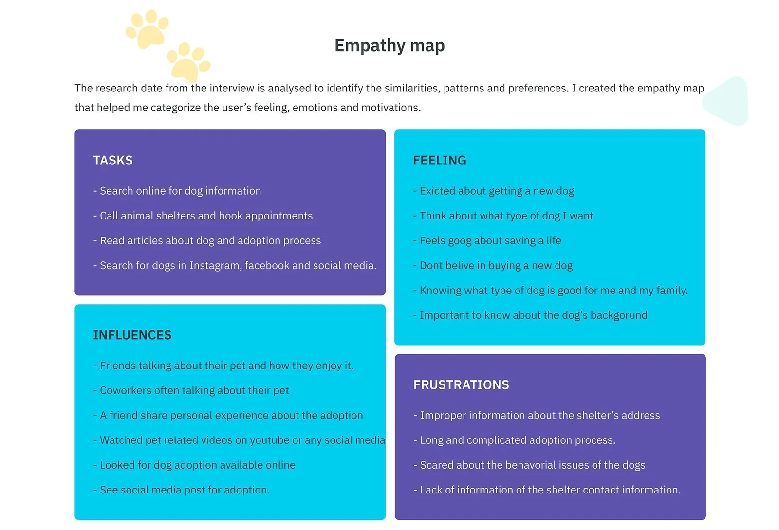
I built an empathy map of the adopter from the interviews. They were excited about a new dog and felt good about saving a life. Missing shelter contact details and a long, complicated process wore them down, and they worried about a dog's behavior. What they wanted was a dog that fits their life, from a source they can trust on its health.
Flows and structure
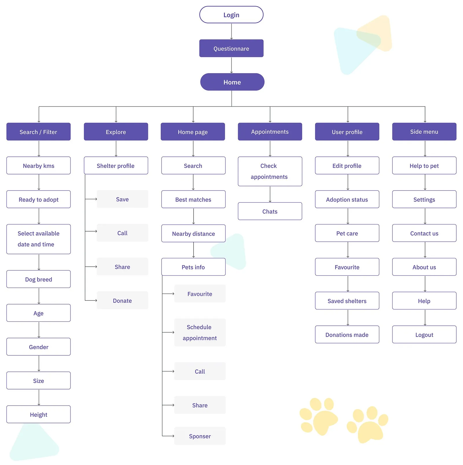
The flow runs from registration and phone verification to a short questionnaire, then home. From home it branches six ways: search and filter, explore, the home feed, appointments, profile and a side menu. I mapped every screen under each branch.
Wireframes
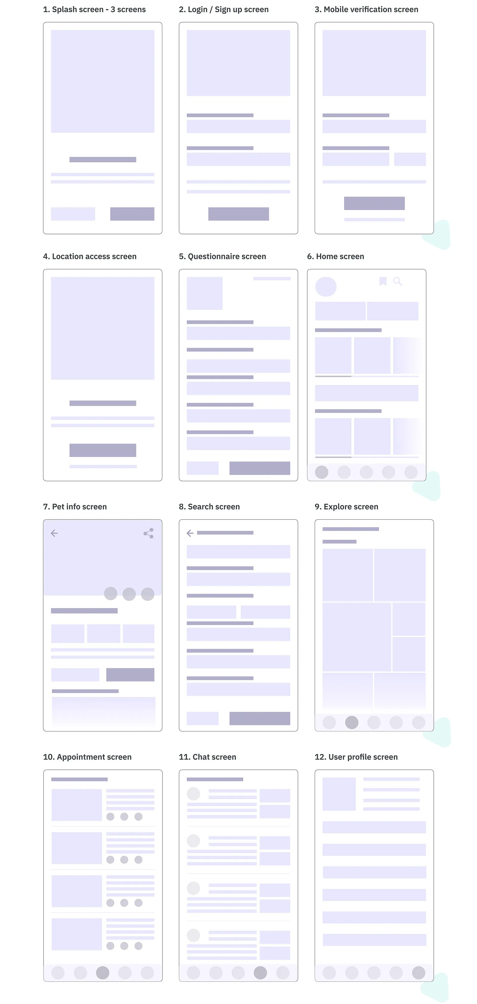
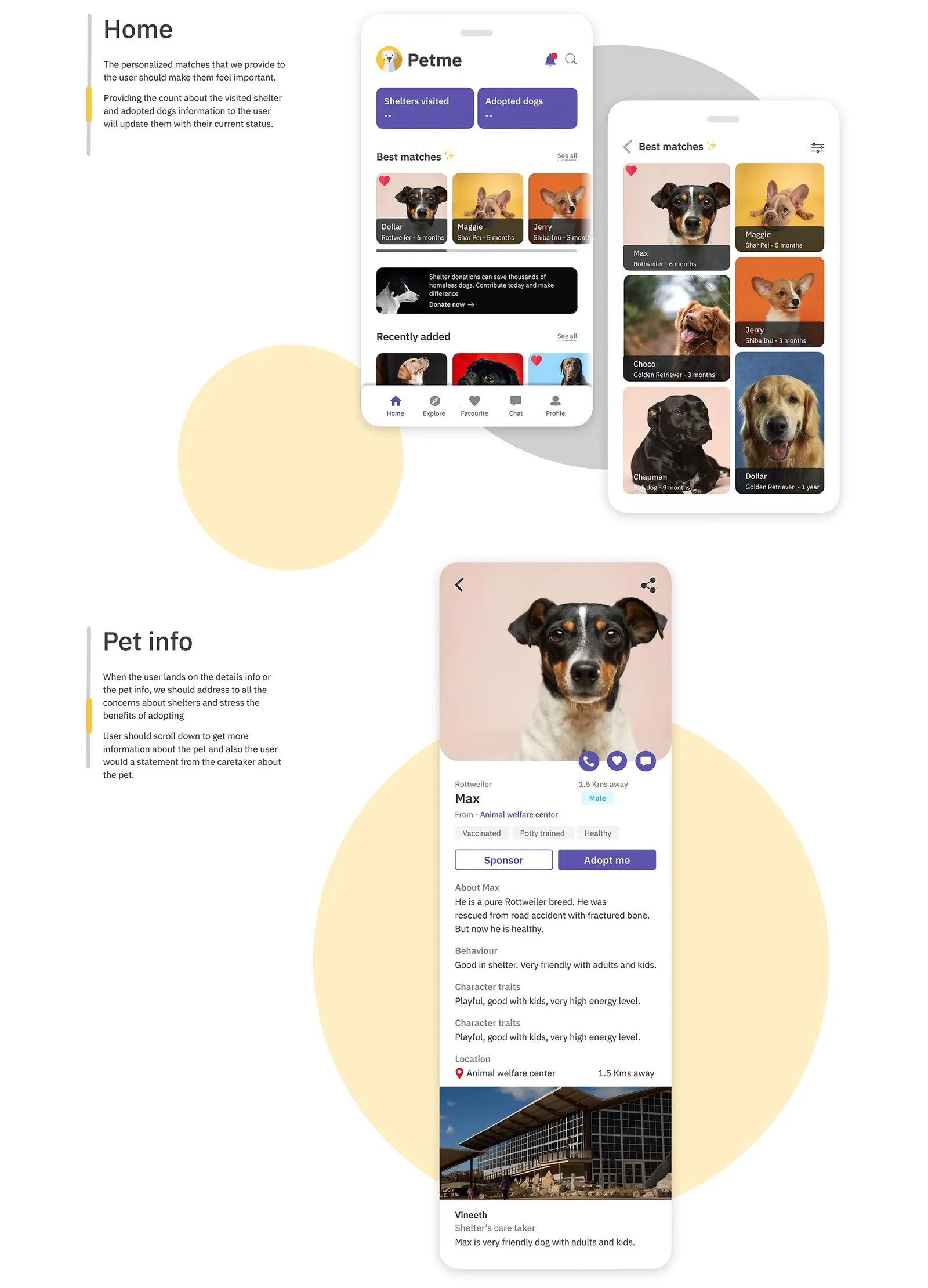
I wireframed 12 screens in low fidelity, from the splash screens to chat and profile, before any color went in. Home got scrolling rows of dog cards and explore got a photo grid.
Design
The design puts matching first and answers shelter doubts on every dog's page. It's a deep purple (#5E54AC) with a warm yellow accent (#FEC738), set in IBM Plex Sans.
Matching starts at signup. A 2-step questionnaire asks whether you'll commit to training, can give a dog daily exercise, have a spacious home, and what your personality is. Home then leads with your best matches.
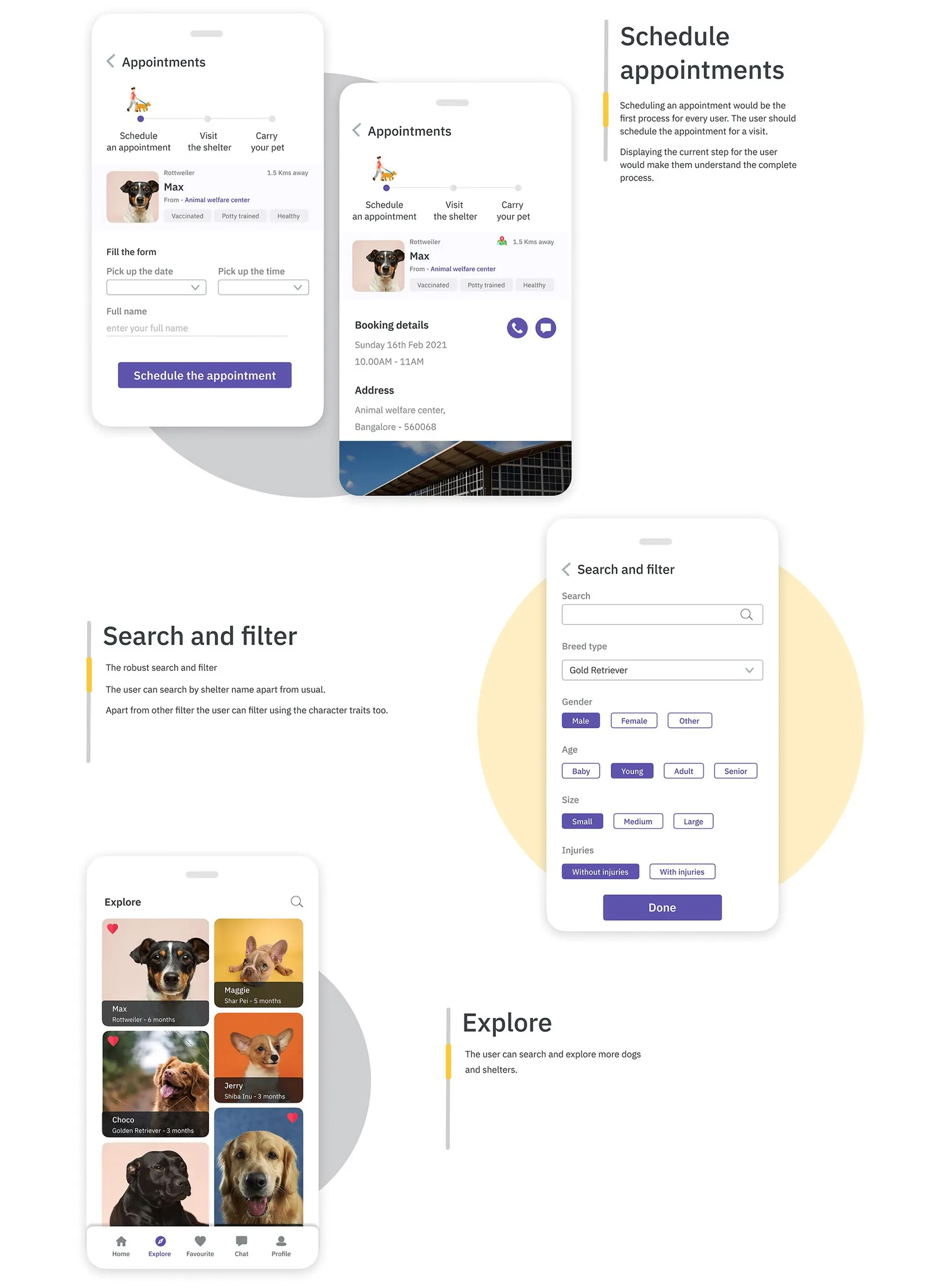
Each dog's page shows vaccinated, potty trained and healthy tags, its behavior and character traits, the shelter's distance and a note from its caretaker. Search filters by breed, gender, age, size and injuries, or by shelter name.
Booking a visit
Booking is the first real step for every adopter, so the appointment screen shows a 3-step tracker: schedule, visit the shelter, bring your pet home. The confirmation keeps call and chat buttons next to the booking details.
Chats with shelter caretakers get their own tab. The profile holds adoption status, pet care, training guides and donations made.
Looking back
This was an assignment, and it sharpened my research technique. It felt hard early on and got smoother once I understood what adopters needed. The work stops at high-fidelity screens, before the test stage of my process plan.
This study comes from my earlier portfolio, where it was one long image. I rebuilt it as a readable page in 2026; the figures are the original slides.