
Methods
- Competitor review
- User interviews
- Persona
- User flow
- SUS survey
- Wireframes
- Style guide
- High-fidelity design
The problem
Admins running an online store had trouble getting accurate information about their own business. They got lost among too many features and options, and they struggled to keep up with customer enquiries, order fulfillment and returns.
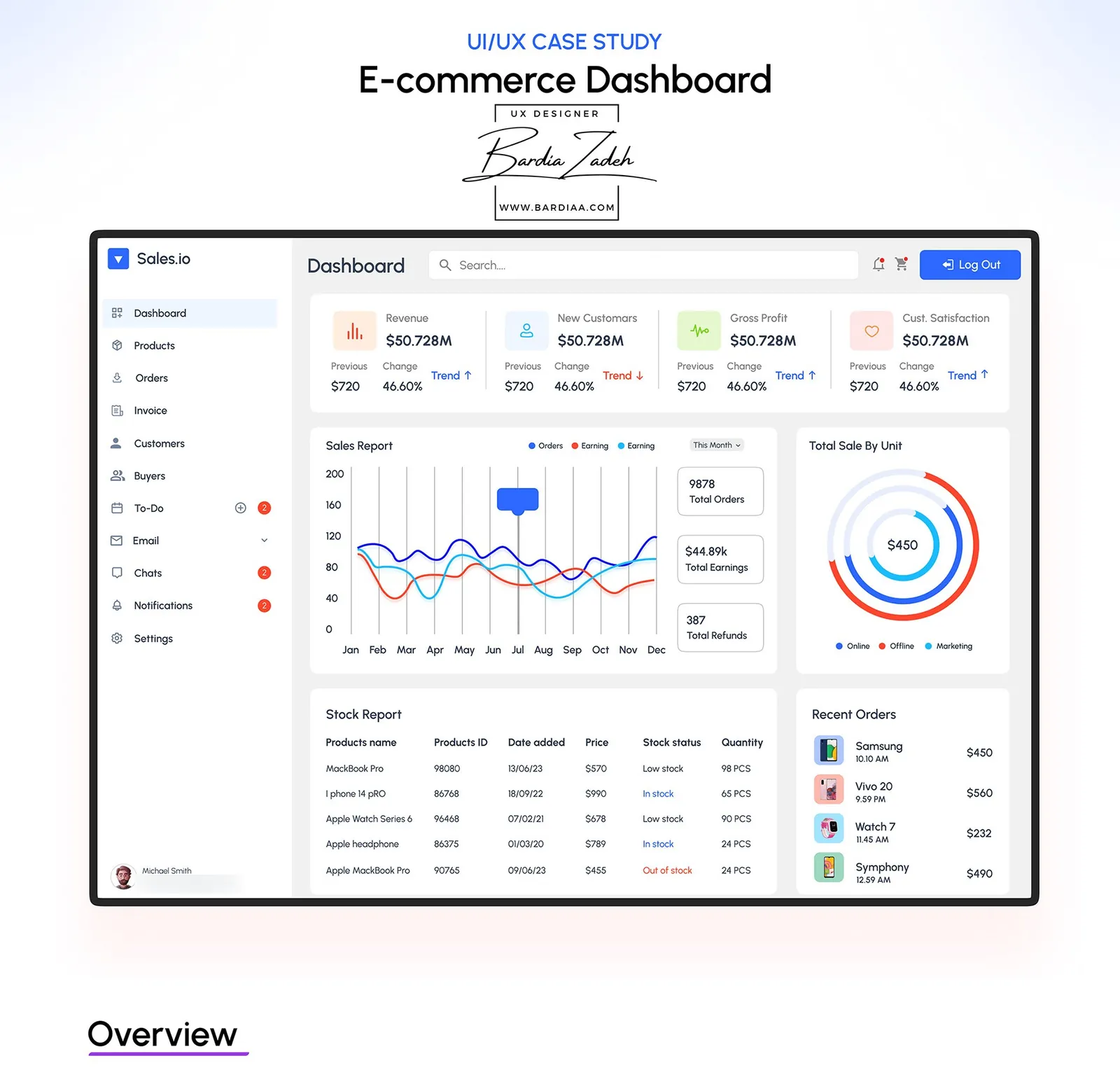
Sales.io is the dashboard I designed for them. An admin can check gross income, sales, stock and customer orders in one place, and deal with customer issues fast.
Research
We started with interviews. We talked to 10 users aged 20 to 35, and most of the questions were about the admin side of a store: updating inventory and the product catalog, handling fulfillment and shipping, answering support tickets and keeping customer data private.
I also looked at four competitors: Shopify, WooCommerce, BigCommerce and Magento.
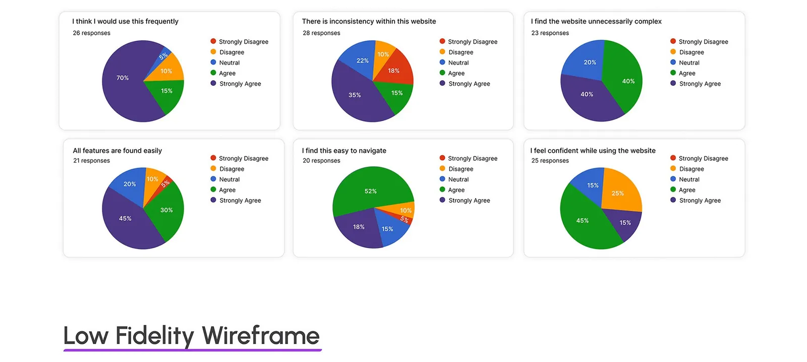
The System Usability Scale (SUS) survey I ran had six statements, with 20 to 28 responses each. The answers pulled in two directions. 70% strongly agreed they'd use it frequently and 52% agreed it was easy to navigate. But 40% agreed and another 40% strongly agreed it was unnecessarily complex.
Who it's for
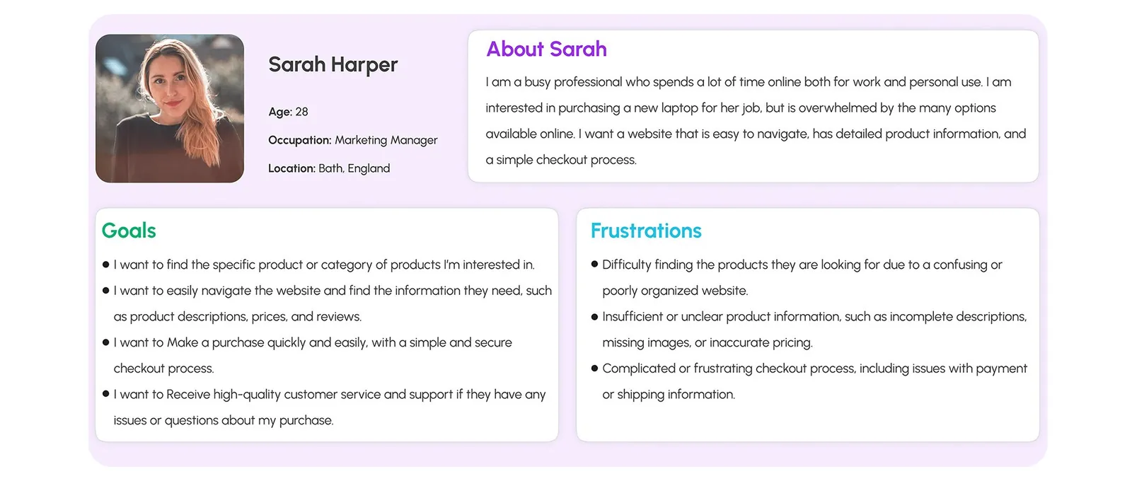
Both personas I wrote are shoppers. Sarah Harper, 28, is a marketing manager in Bath who's overwhelmed by laptop options and wants clear product details and a simple checkout. John Nicholas, 35, is a construction worker in Edinburgh buying tools, and he's not very tech-savvy.
John's frustrations are the ones an admin ends up handling: slow customer service, late or damaged deliveries, promotions that don't work as advertised and no easy way to leave a review.
Flows and structure
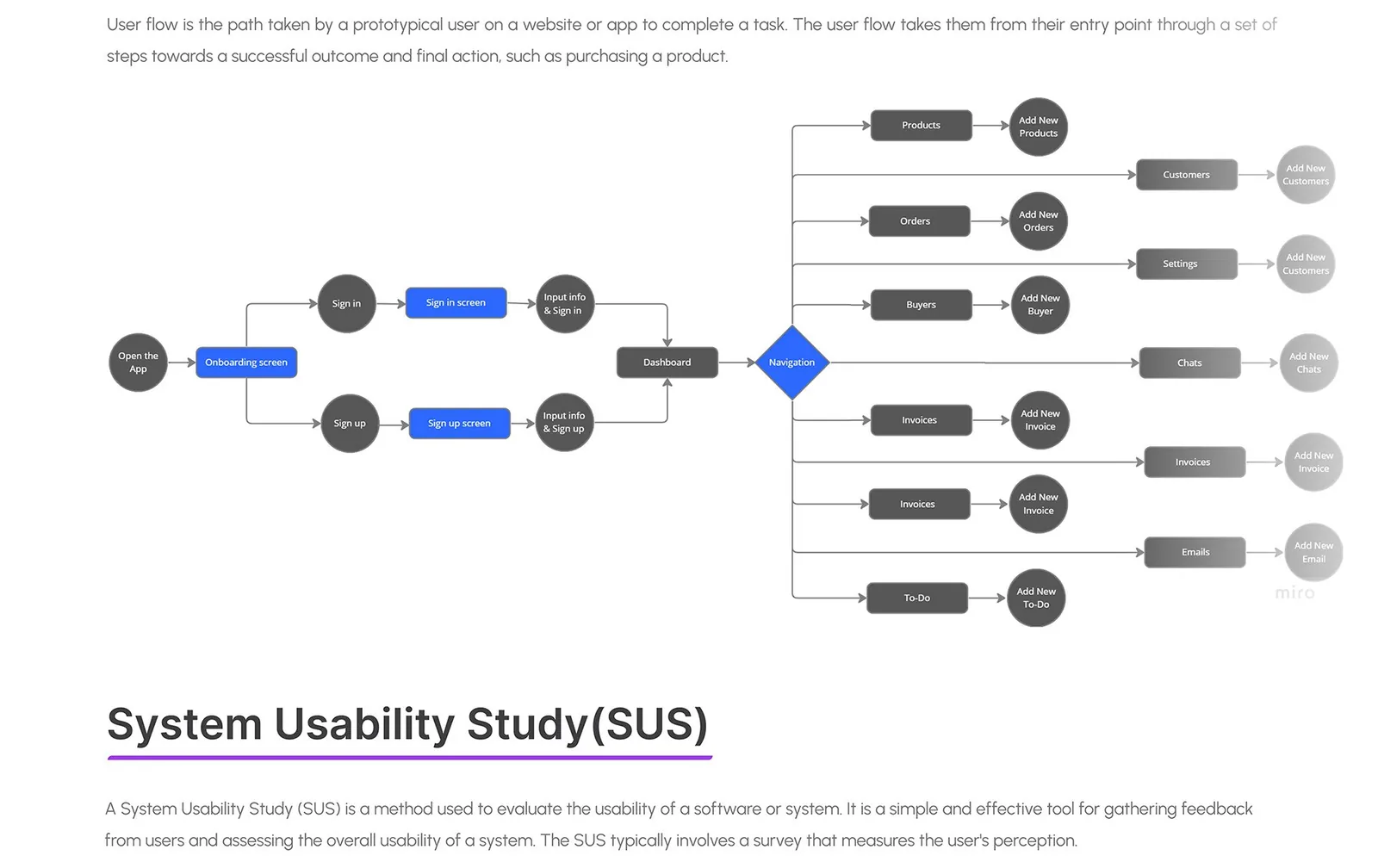
The flow is shallow. After onboarding and sign in or sign up, the admin lands on the dashboard, and one navigation menu branches out to every section.
Products, orders, buyers, customers, invoices, email, chats and to-do each end in an "add new" step. I mapped it all in Miro.
Wireframes
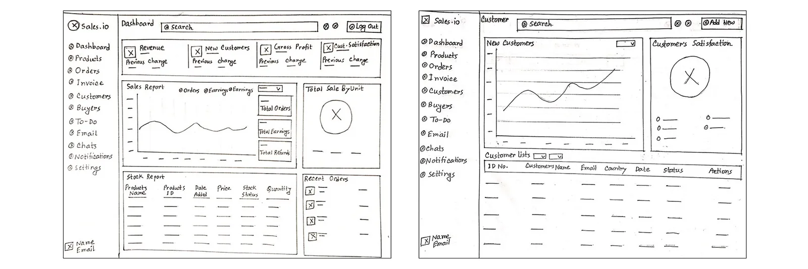
I sketched four screens by hand (dashboard, customers, orders and chats), and the dashboard layout barely moved after that. The sketch already has the KPI cards across the top, the sales report and sale-by-unit chart in the middle, and the stock report and recent orders underneath.
Design
I kept the visual system small. Urbanist is the only typeface, in six weights from Light to Black, and the one accent color is a primary blue, #2D68FE, on dark and white.
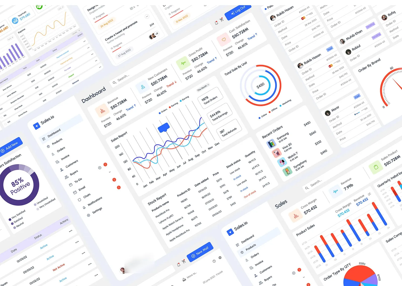
Each KPI card on the dashboard shows revenue, new customers, gross profit or customer satisfaction, with the previous figure, the change and a trend arrow. The stock report marks every product as in stock, low stock or out of stock.
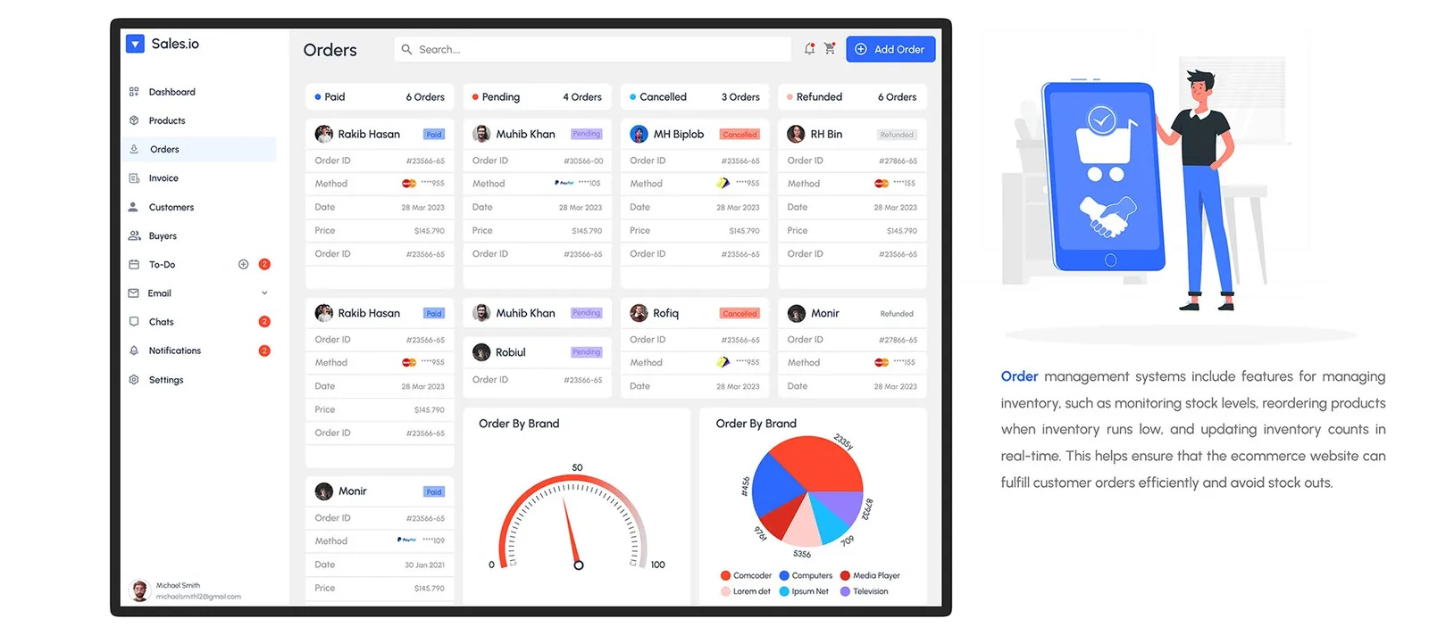
Orders is a board with Paid, Pending, Cancelled and Refunded columns. Each card shows the order ID, payment method, date and price, so a refund sits right next to a paid order.
The full set
I designed 16 high-fidelity screens in total, from the login page to settings. Past the dashboard and orders there's sales, customers, buyers with order tracking and reviews, invoices, a to-do board, an inbox and chat. Settings covers profile, password, notifications, integrations and subscriptions.
This study comes from my earlier portfolio, where it was one long image. I rebuilt it as a readable page in 2026; the figures are the original slides.